Advanced black and grey work runs from a single-session forearm piece to a full back that takes multiple sittings and a healed base before white highlights go in, and the designs below show how that range plays out across religious figures, animals, and symbolic portraits.
Your own pain tolerance and budget for touch-ups matter once you settle on a design, because marble faces lose their brightest highlights within months and dense smoke only reads as atmosphere after the skin settles.
[link-whisper-related-posts]1. Jesus and Mary
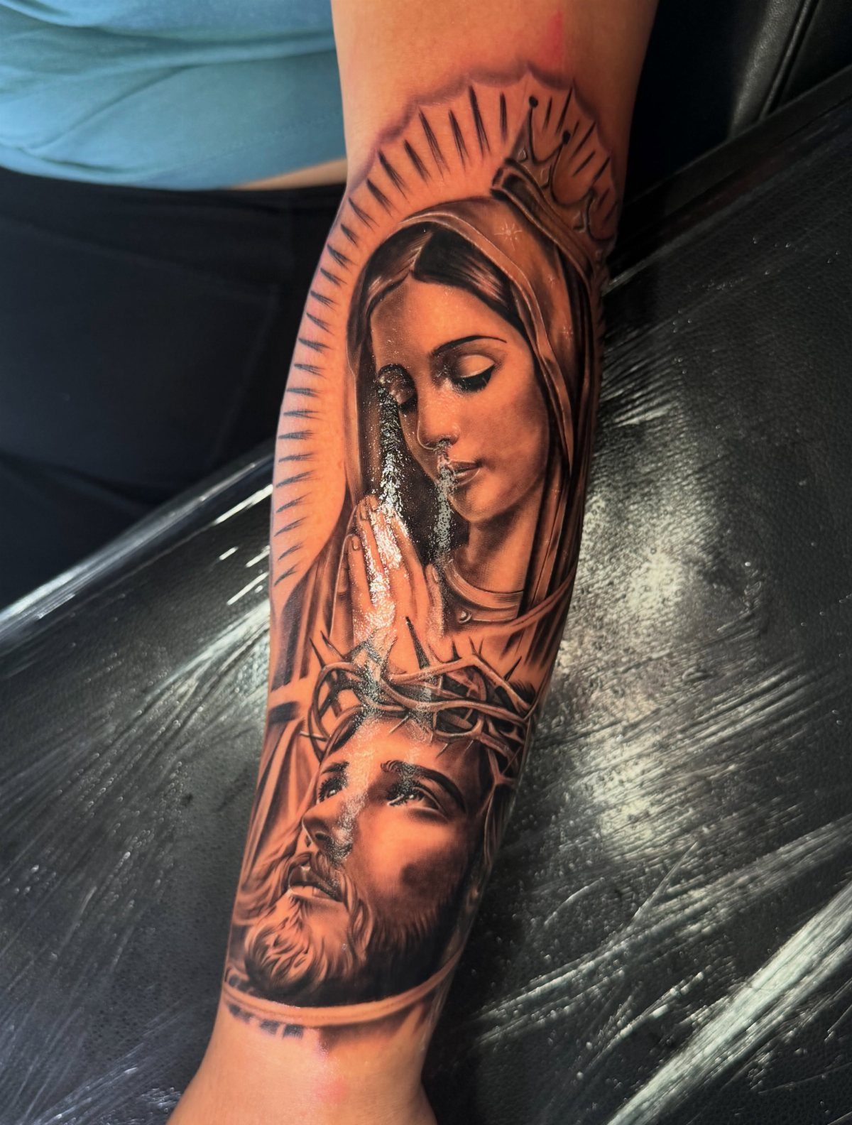
Religious black and grey work demands skin that will hold fine lines without blowing out. A vertical layout stacks Mary above Jesus, which keeps the thorn crown detail readable at a distance where a side-by-side spread would muddy together.
I would place this on a forearm with the wrist down, not up toward the elbow where the taper pinches composition.
The crown of thorns needs room for each spike to read as individual barbs; crowding turns them into grey smear once the skin settles.
Ask your artist to show healed photos of similar religious pieces. Fresh work always looks sharper than settled ink, and this design lives or dies in those hairline transitions between light and shadow on the faces.

Comprehensive Tattoo Ink Kit - Includes 1 premium black electric pigment mixer machine (1.8 x 5.1 inch) and 100 single-use plastic mixing sticks (1.3 inch). Designed for professional artists to maintain a clean, efficient, and sanitary workstation during long sessions.

★ Rotary machine with strong and stable power, suitable for both liner and shader.

UV Protection: Provides UPF 50+ sun protection, shielding more than 98% of harmful UVA & UVB rays. Perfect for football, basketball, tennis, volleyball, golf, and other outdoor activities.
2. Large Skull and Graveyard
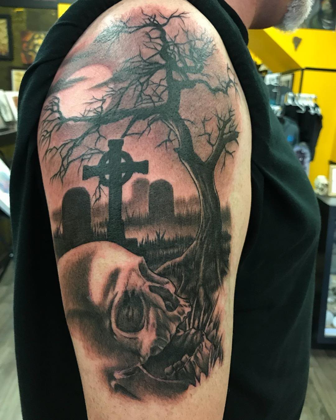
A graveyard scene this dense works best when the skull anchors the bottom and your eye travels upward through the story.
The bare tree and Celtic cross placement matters more than most clients think; too high on a shoulder cap and the cross disappears into your armpit shadow.
Smoke in black and grey is where apprentices struggle and masters show off.
It is not grey wash blown around; it is deliberate negative space left between layers of stipple and soft edge. The bare tree behind gives depth that flat tombstone rows cannot manage alone.
This much black means multiple sessions and a healed base before the white highlights go in. Budget for that from the start, or the smoke reads as unfinished grey instead of intentional atmosphere.

PACKAGE CONTENTS: There are 3 packs black temporary tattoo ink, 103 patterns tattoo stencils and one pin included in this comprehensive kit

3. Egyptian Jackal God
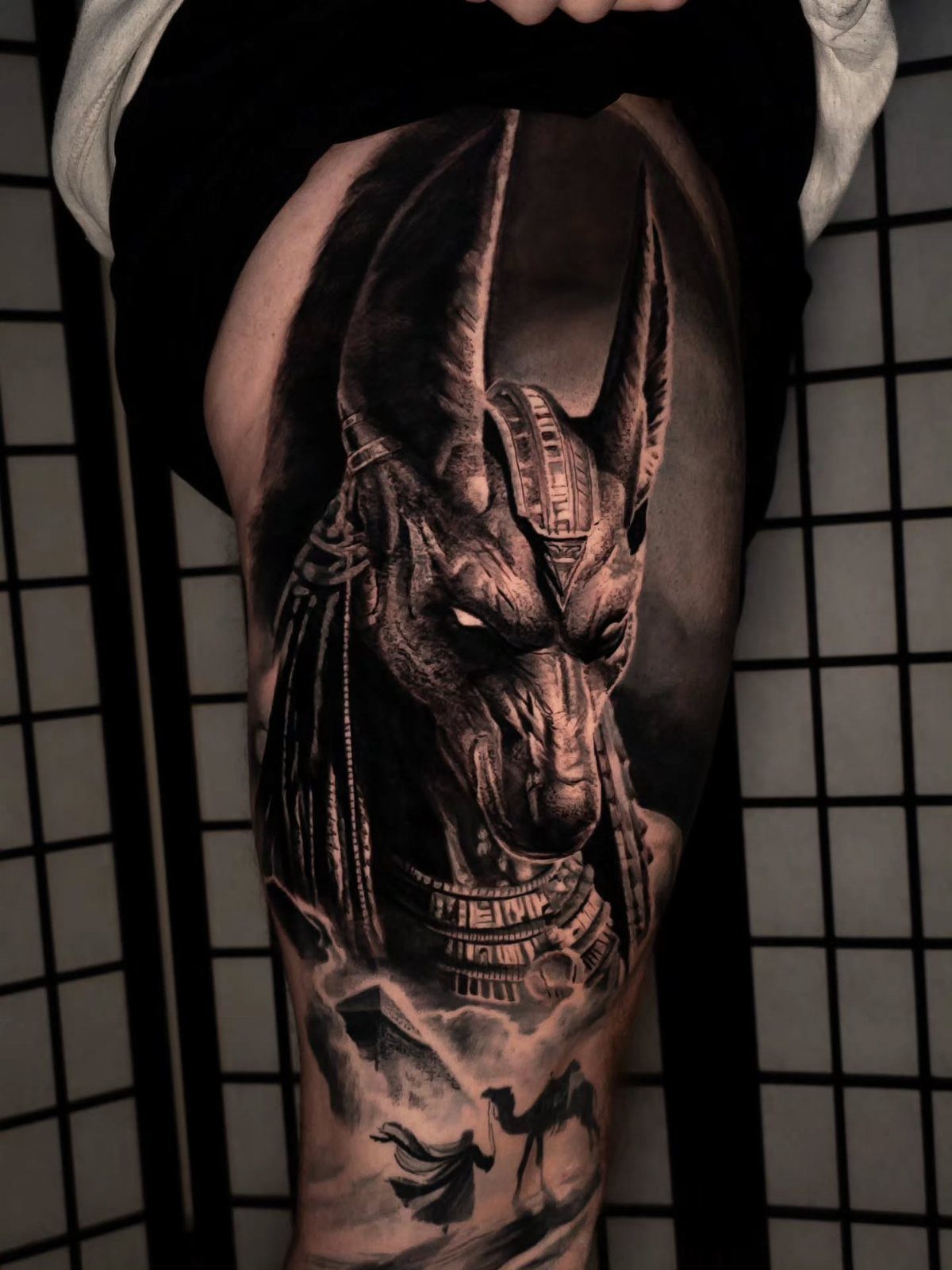
Anubis carries enough visual weight that ornate jewelry becomes the detail work, not the main event.
The collar and headpiece frame the jackal face; without them, the figure reads as generic canine. With too much, the god gets lost in pattern.
The smoky texture behind is what separates museum-catalog Egyptian from tattoo that breathes.
I have seen versions where the smoke carries faint skull silhouettes, which sounds heavy-handed until you see it pulled off with the grey value held back to mid-tone.
Thigh placement gives the vertical room this composition needs.
The pyramids and camel sit low, near the knee, where they will not distort much with walking. Fabric flow follows the muscle line; ignore that and the cloth looks pinned on, not worn.


Package: 50pcs mixed size tattoo cartridge needles set, includes 5pcs each of 1005RL, 1007RL, 1009RL, 1205RS, 1207RS, 1209RS, 1015M1, 1021M1, 1015RM, 1021RM; Those tattoo needles can be used for lining and shading, which can assist you to complete the entire tattoo work

Cartridge Needles Sizes: 20 pcs tattoo cartridge needles include 3RL 5RL 5RM 7RM, each size has 5pcs. Those tattoo needles can be used for lining and shading, which can assist you with the entire tattoo work
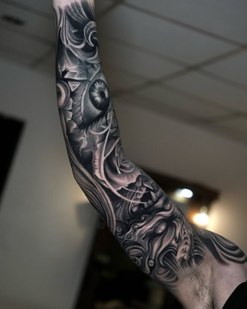
4. Cracked Marble Face
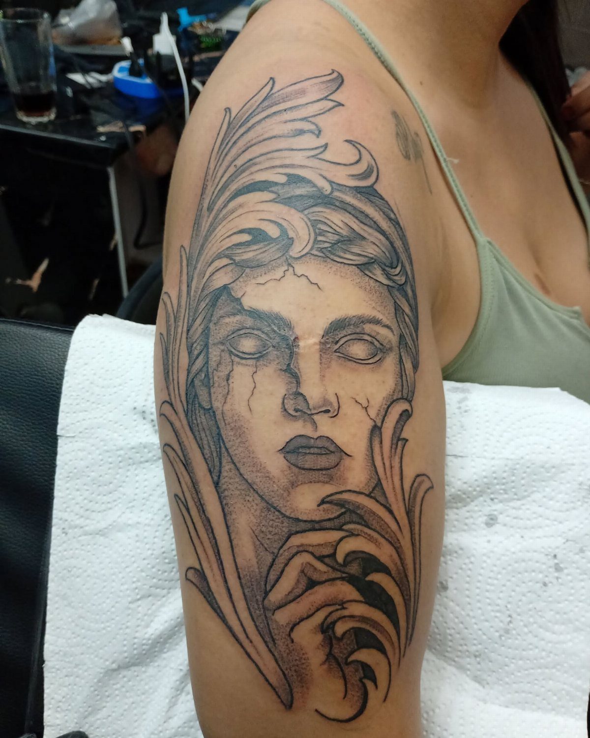
Marble texture in skin is a specific technical ask, not a style any black and grey artist automatically handles.
The cracks need to read as damage to stone, not scratches on a portrait, which means varying the crack width and adding chip shadows at the edges.
The acanthus leaves visible here do double duty; they soften the face where it meets the arm, so the stone does not look pasted on flat skin.
Red roses are a color option, but the black and grey version keeps the classical monument feel without the romantic tattoo cliché.
Healed, marble tattoos often lose the brightest highlights first. Plan for a touch-up once the initial heal settles to push those face planes back up where they belong.

VERSATILE TATTOO INK COLOR SET: Our vinrant tattoo ink color set features four shades of gray tattoo ink—Light, Light Medium, Medium Dark, and Dark. Ideal for blending and mixing, this professional tattoo ink simplifies your color palette, saving time for artists.

MADE IN THE USA SINCE 1990: For over 30 years Dynamic Color has produced professional tattoo ink in the United States, an established American brand artists built their work on long before most imported labels existed.

MADE IN SPAIN, REACH COMPLIANT: Ganga Black is produced in the European Union and formulated to REACH, the EU regulation that restricts hazardous and banned substances used in tattoo ink.
5. Lion with Clock Face
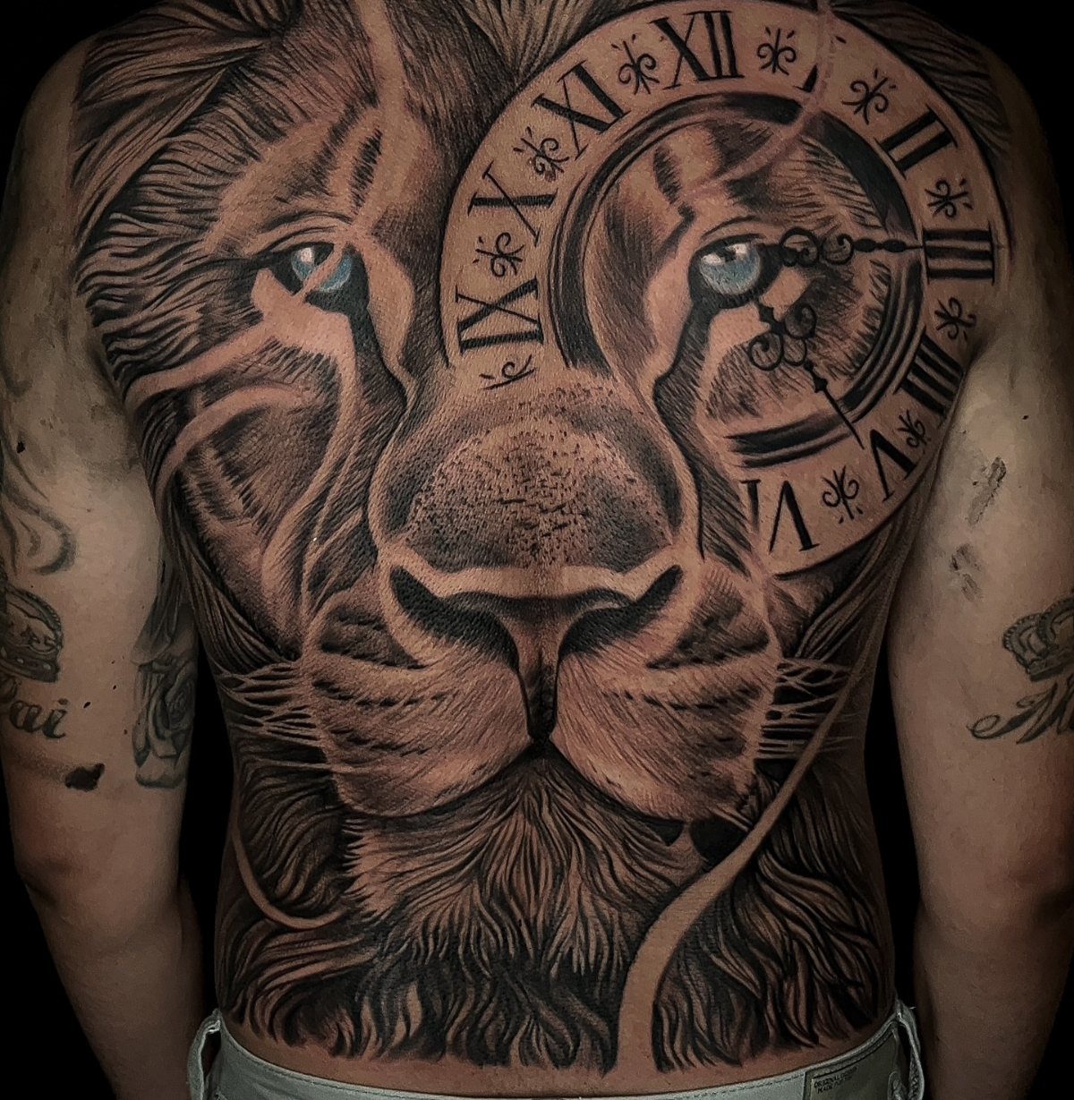
A clock face over one eye sounds like it would blind the lion, but the composition uses the numeral ring as a mask frame instead.
The smoke effects behind keep the clock from reading as a flat disc slapped on fur; without that atmospheric depth, you get a sports logo, not a tattoo.
Roman numerals at this scale need to be simple: IIII instead of IV for the four o’clock position, because the subtractive notation shrinks to illegibility.
I have watched clients insist on historical accuracy and regret it once the piece heals and settles in.
Full back is the only placement that carries this much detail without cramming.
A half-back version loses the smoke and the lion becomes a shoulder sticker. Commit to the real estate or pick a simpler single-focus design.

TATTOO AFTERCARE ESSENTIAL: Hustle Butter is the original tattoo aftercare balm for new and older tattoos. With over 10 years in the market, we are a pioneer of the tattoo aftercare category.

FRAGRANCE FREE TATTOO AFTERCARE FOR SENSITIVE SKIN - The same #1 artist recommended Hustle Butter formula, now with no added fragrance, dyes, or parabens. The unscented tattoo lotion of choice for sensitive or easily irritated skin.
PROTECT & SOOTHE: Condition & protect your tattoos to keep ink looking bold & vibrant. Soothing, nourishing tattoo care softens fresh tattooed skin, calms redness & irritation, and promotes healing
6. Koi Fish with Flowers
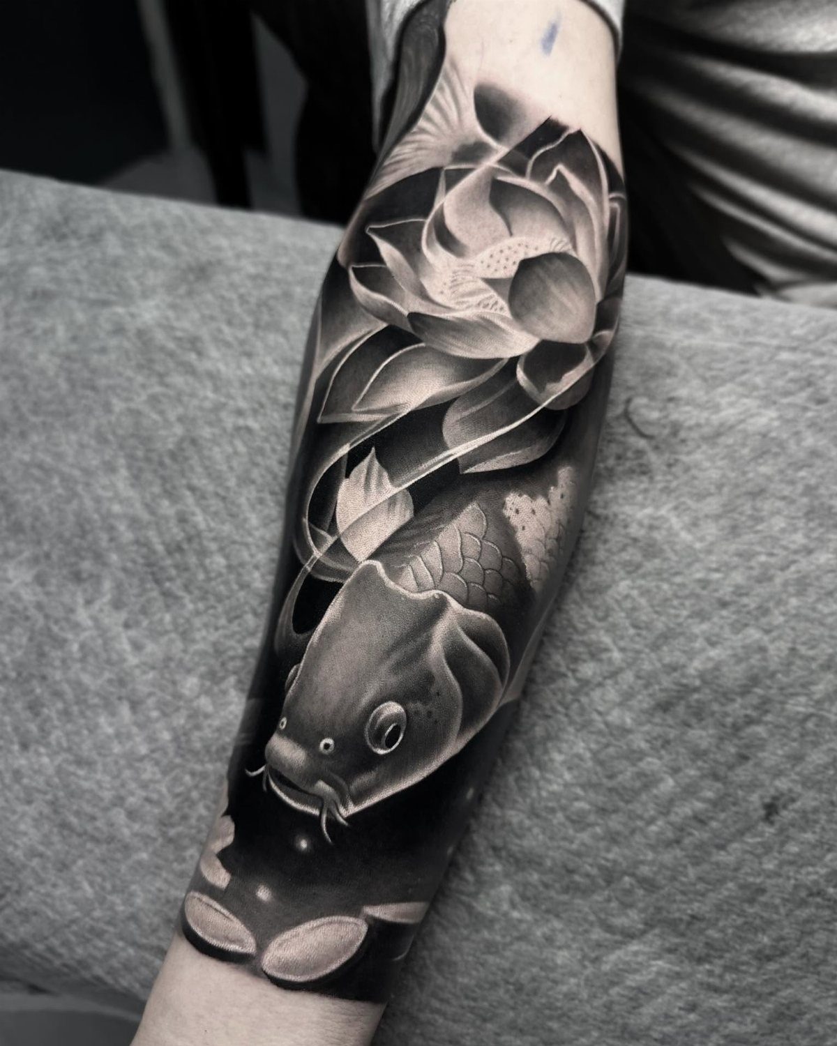
Koi and lotus is a pairing old enough to be its own subgenre, which means your artist has probably done 3 versions already.
The difference between routine and standout is in the water: swirling waves with actual current direction, not decorative background filler.
Lotus leaves in black and grey trade obvious color for texture work.
The petals need to read as tissue-thin against the koi’s scaled body, which means lighter stipple or single-needle line on the flowers, heavier saturation on the fish. Reverse that and the whole piece flattens.
Forearm placement like the photo keeps the swimming direction natural, head toward the hand. I have seen koi pointing elbow-ward and it looks wrong every time, like a mounted fish facing backward on the wall.

[Tattoo Supplies with Complete Accessories] This complete tattoo machine kit includes 1 wireless pen machine, 20 needles, 1 black ink, 3 practice skins and essential accessories—ideal for beginners and artists seeking a maquina para tatuar

WIRED VOLTAGE FOR A MORE CONSISTENT PRACTICE SESSION: When you are learning, it helps to remove variables you may not yet know how to recognize. The Atom tattoo pen connects directly to the included adjustable power supply, providing steady voltage throughout your practice session. Some battery-powered pens may require more attention or adjustment as the battery level drops, while a wired setup helps keep the machine response more consistent from the first line to the last

7. Large Blooming Peonies
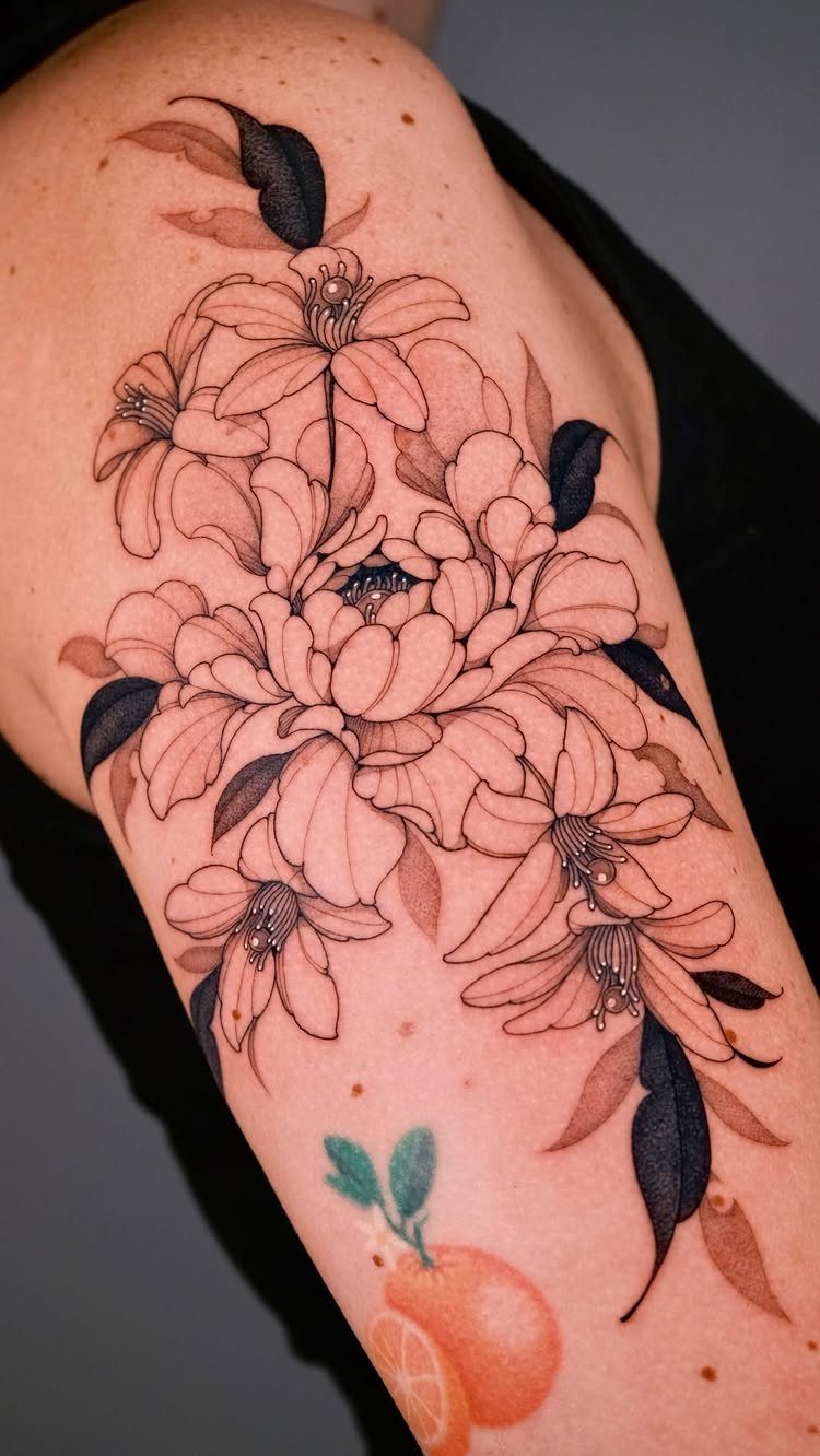
Peonies carry enough petal layers that smooth grey shading becomes the whole point of the piece; stipple or hatching reads as texture on texture and fights the flower’s natural softness.
The lilies surrounding the central bloom need lighter handling so they do not compete for attention.
Upper arm placement gives the diameter these flowers need to open fully without wrapping onto the shoulder cap where the curve distorts the round bloom shape.
White highlights on the petal edges are what sells the volume, but they close up fast on skin that tans; plan for a refresh if you spend summer outdoors.

Comprehensive Temporary Tattoo Kit Our all-in-one temporary tattoo kit includes 12 vibrant bottles of tattoo ink: 2 Black (for more designs!), Blue, Red, Green, Purple, Orange, Navy Blue, Brown, Pink, Grey, and Yellow. Combined with 95 pieces of diverse tattoo stencils, this kit provides everything you need to express your creativity and style effortlessly.

PACKAGE CONTENTS: There are 4 packs black temporary tattoo ink, 103 patterns tattoo stencils and one pin included in this comprehensive kit

💖LONG LASTING WATERPROOF: The Black tattoo pastes are long lasting. The color darkens over time (24-48 hours) and lasts 7 to 12 days before fading. When dry, it is waterproof, but can also be easily removed by rubbing soapy or makeup remover.
8. Blindfolded Lady Justice
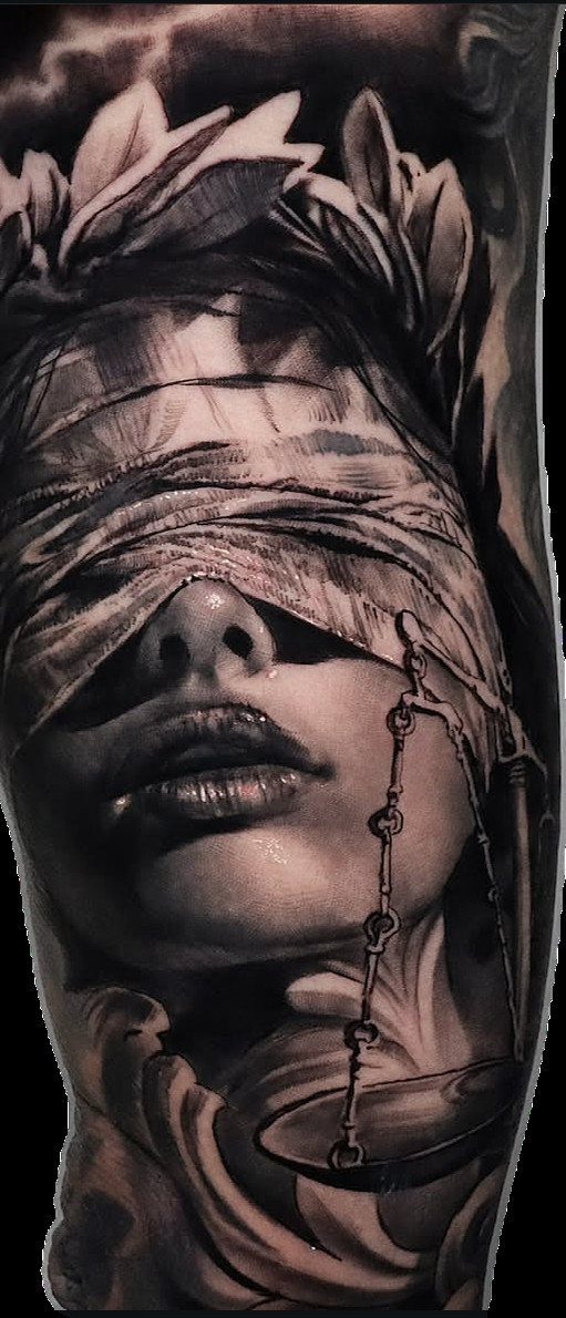
Lady Justice in black and grey trades the usual gold scale and red sash for value work alone; the blindfold, the laurel, and the scales must each read as separate objects without color to separate them.
Push the darks in the wreath and keep the face mid-tone so the cloth does not disappear into skin.
The anatomical heart variation some artists use adds narrative weight, but the classic scales version ages cleaner; hearts and arrows trend toward dated symbolism once the novelty fades.
Forearm or calf placement keeps the vertical composition straight, which matters more than usual because a tilted scale reads as imbalance, not style.

Poseidon cartridge adopt a one-time joint design hygienic standard The material is stainless steel and easy to color,and has better ink flow

[5 Round Magnum Sizes x 10pcs] This #12 RM mixed set includes 10pcs each of 1207RM, 1209RM, 1211RM, 1213RM, and 1215RM, 50 cartridges total. The size range gives artists a clear round magnum progression from tighter shading to wider coverage, making it a practical refill pack for black-and-grey, gradients, and color fill work.

Package: 50pcs mixed tattoo cartridge needles, includes 10pcs each of 1203RL, 1205RL, 1207RL, 1209RL, 1211RL.
9. Egyptian Falcon and Hieroglyphs
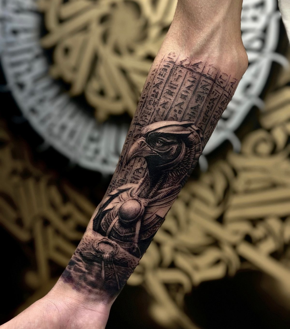
Horus with hieroglyphs is a different challenge than Anubis; the falcon head has harder planes and less forgiving symmetry, so the stone tablet background does the compositional work of softening what could read as mechanical.
The ankh at base anchors the design and gives the eye a resting point after the busy glyph field.
Forearm length matches the tablet proportion without cropping; thigh placement would stretch the hieroglyphs past readability.
Check that your artist has done stone texture before, not just smooth black and grey; carved glyphs need chip marks and edge wear to read as ancient, not printed.

MADE IN THE USA SINCE 1990: For over 30 years Dynamic Color has produced professional tattoo ink in the United States, an established American brand artists built their work on long before most imported labels existed.

Professional Tattoo Ink - Many of the most popular tattoo artists around the globe turn to World Famous' bold, beautiful tattoo ink, tattoo supplies & tattoo kits to deliver a flawless work of art.

Light medium and dark greywash shades cover the full range needed for smooth shading transitions and layered depth in black and grey work
10. Winged Hooded Warrior
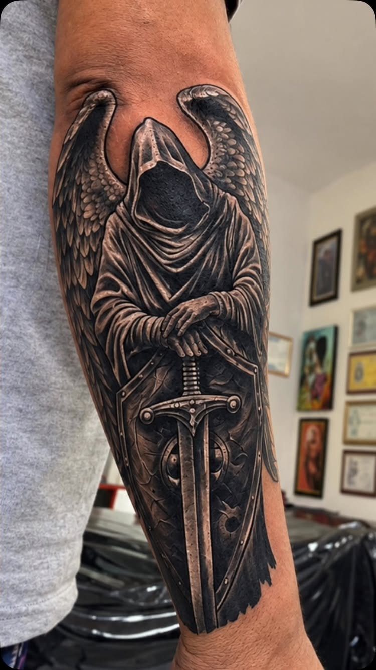
A hooded figure with wings this large lives or dies by the feather layering; each row needs distinct value so the wing reads as thickness, not a flat fan.
The sword and shield in front give the composition its depth, but they also hide the body where an apprentice might shortcut anatomy.
Void-face versions trade expression for mystery, which works better in cover-ups where the old tattoo sits under the hood shadow.
This forearm placement keeps the wingspan across the inner and outer arm; wrapping onto the bicep distorts the wing geometry with every curl. Ask to see healed photos of the artist’s feather work specifically, not just fresh ink.

Nourishes Healing Ink for Vibrant Color: Tattoo Goo supports healing tattoos & maintains vibrancy on healed ink with a lightweight formula rich in olive oil, lavender oil, cocoa butter, and beeswax. It absorbs quickly, moisturizes deeply, and helps reduce dryness, itch and tightness so your tattoo looks and feels comfortable through everyday routines

Tattoo Aftercare Balm Stick: our tattoo balm is now available in a balm stick. This tattoo balm stick delivers targeted care to keep your artwork looking and feeling fresh whenever you need it most. For use on all tattoos, just not fresh ones.

Nourishes Healing Ink for Vibrant Color: Tattoo Goo supports healing tattoos & maintains vibrancy on healed ink with a lightweight formula rich in olive oil, lavender oil, cocoa butter, and beeswax. It absorbs quickly, moisturizes deeply, and helps reduce dryness, itch and tightness so your tattoo looks and feels comfortable through everyday routines
11. Ghostly Hooded Figure
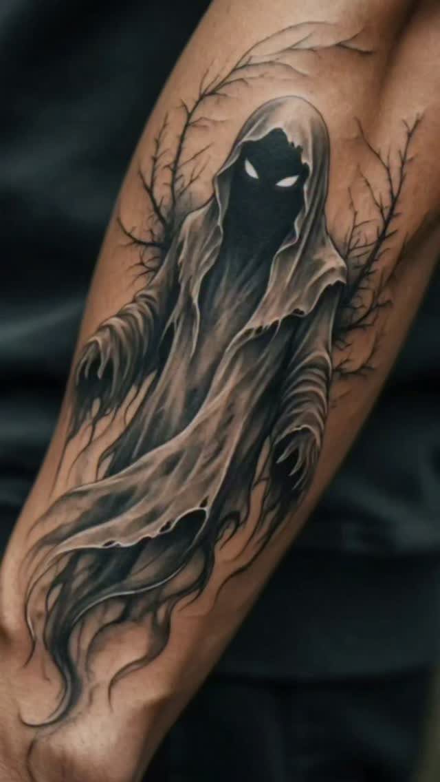
Glowing eyes in black and grey are negative space with a thin white halo, nothing more; the effect depends on the surrounding dark being dense enough that the eyeholes read as light source rather than blank skin.
Tattered fabric gives the artist chance to show edge texture, but too many rips and the cloak loses its mass.
Barren branches behind frame without competing; leafy or flowering background would fight the death-mood this piece targets.
The hooded wraith format suits cover-up work because the face shadow swallows old ink underneath, though the glowing eyes need to sit clear of the previous tattoo or the light effect muddies.
Meaning of Black and Grey Tattoos
Black and grey ink carries a visual weight that color sometimes distracts from.
Without hue to separate elements, the design relies on value alone: the full range from skin tone through charcoal to solid black. That limitation forces clarity.
A piece built this way tends to read as more permanent, more settled, which suits subject matter about loss, memory, or time passing.
A bright koi in orange tells a different story than the same fish in grey wash; the palette has to match the theme.
Religious imagery in particular gains gravity without color.
The marble face entry shows how stone texture replaces painted realism with something closer to memorial sculpture. The emotional register is quieter, which some clients want and others mistake for coldness.
Durability of Black and Grey Tattoos
Black pigment is carbon-based and physically larger than most color particles, so the immune system has a harder time breaking it down.
That is why a solid black line holds its edge where a red or yellow line may fade to haze within a few years.
Grey is simply black diluted with distilled water or a mixing solution, so the same durability applies at every value.
The stipple and soft-edge smoke effects in the graveyard and warrior entries above depend on that stability; a technique that relies on subtle gradation would not survive if the medium shifted over time.
Black can migrate. Dense saturation near fine detail risks blowout, where ink spreads under the skin and blurs what was sharp.
The thorn crown, the clock numerals, the hieroglyph edges all show how fine lines spread and soften over time. Placement matters as much as pigment choice.
Frequently Asked Questions
What is the meaning behind a black and grey tattoo?
A black and grey tattoo strips away the noise of color so the eye reads shape and shadow first, not hue. The artist builds everything from one pigment, stretching it from bare skin through mid-tones to pitch black.
That restrained palette settles into the skin like something that was always there, which is why memorial pieces and sacred figures carry extra weight without a single drop of color.
Do black and grey tattoos last?
Carbon black particles are physically larger than most color pigments, so the body takes longer to carry them away.
Grey starts as the same black ink cut with distilled water or mixing solution, meaning every tone shares that same staying power.
Even with durable pigment, packing black tight against hairline detail can push ink outward under the skin and blur what was crisp, so where you place it matters as much as what you place.