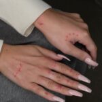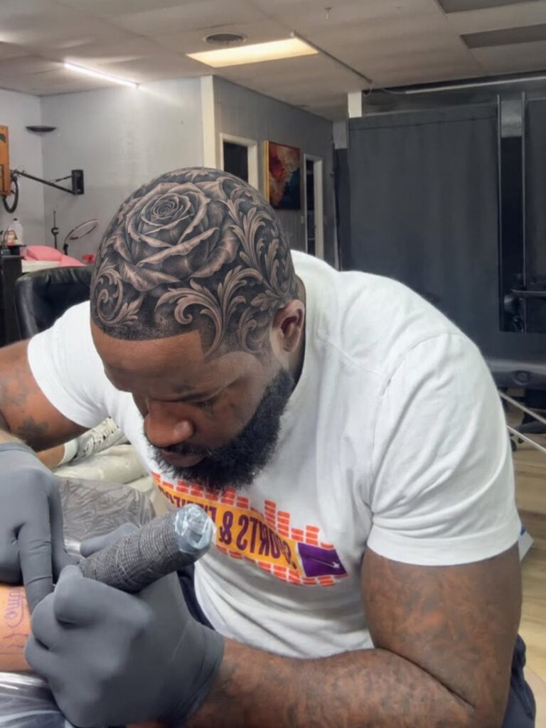
Victorian tattoo work ranges from a single ornate key on a forearm to a full gothic sleeve built across multiple long sessions.
What decides which idea is yours is how much skin you are ready to commit and whether you want one period object like a skull in a top hat or an entire crowded world of acanthus, portraits, and keys.
[link-whisper-related-posts]1. Acanthus Leaf Patterns
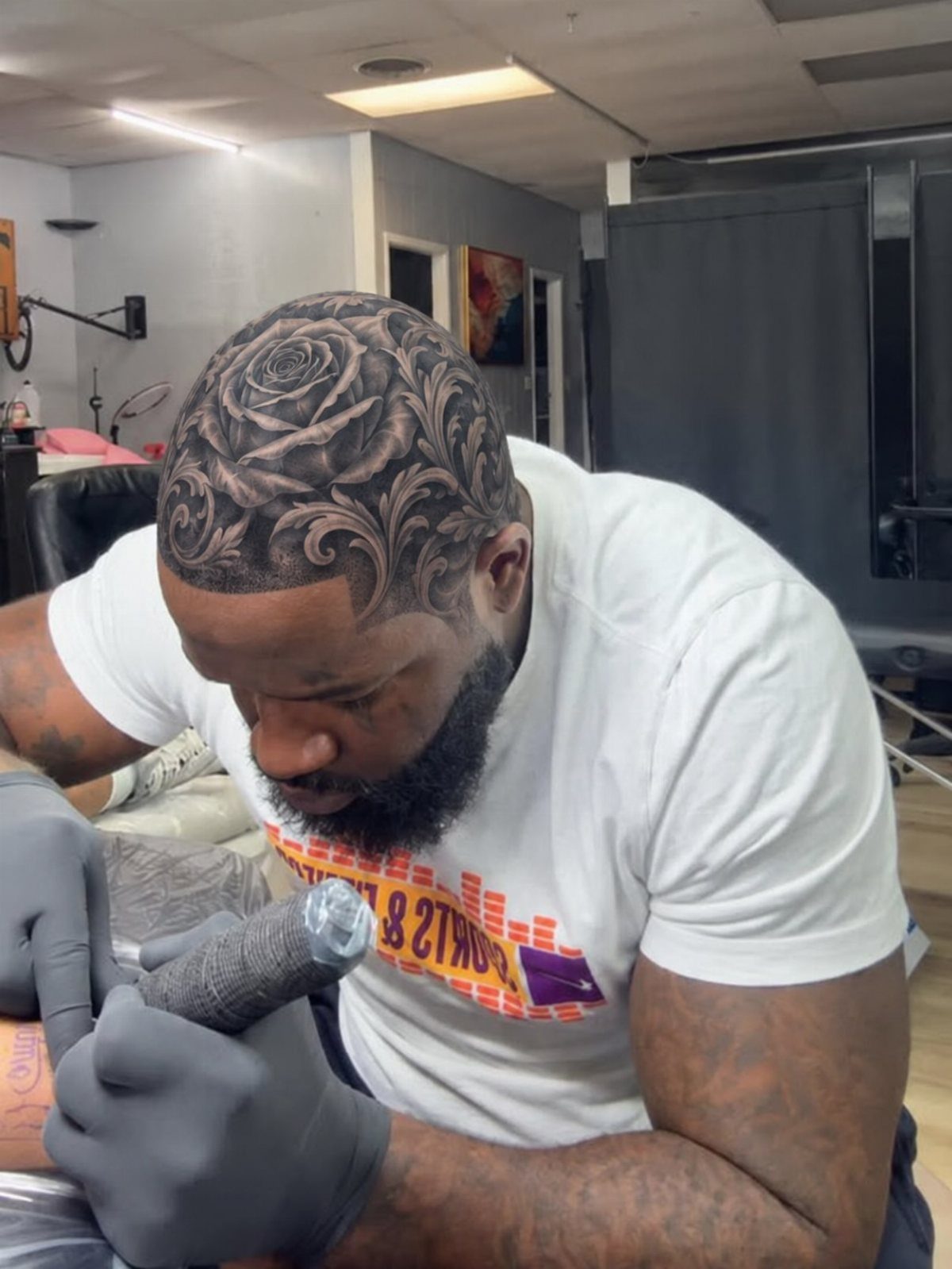
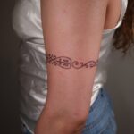
Acanthus leaf scrollwork brings the same engraved borders you see on old banknotes and iron gates onto skin.
The pattern builds from a central stem that splits into curling leaves, each one shaded with fine parallel lines that read as depth from a few feet back.
This works best as a frame for something else, a rose or a portrait, rather than standing alone.
The lines need to stay crisp, so I would place it somewhere that does not bend much: upper arm, calf, or along a collarbone. Black ink holds the detail; color tends to blur the hatching.
The scrolls can grow to wrap a larger piece or stay tight as a band.
Either way, the artist needs a steady hand for the thin strokes. Ask to see healed photos before you book; the finest lines are the first to fade.
2. Gothic Victorian Tattoos
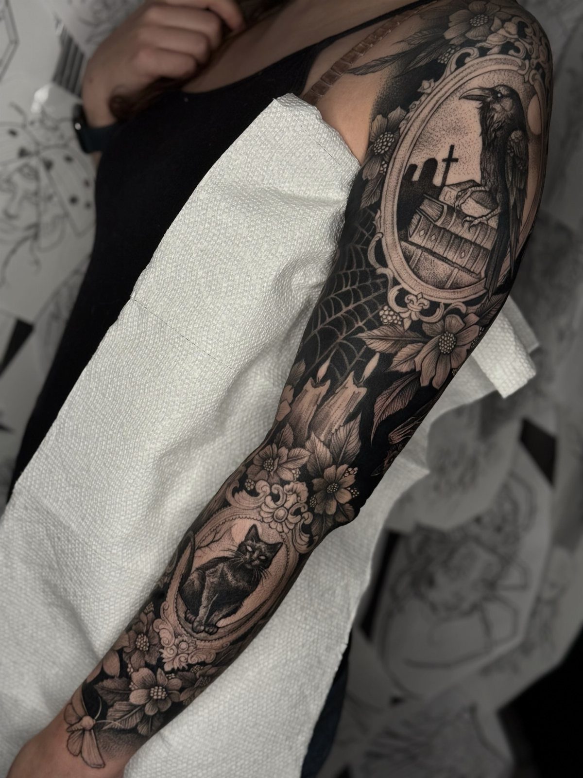
A gothic Victorian sleeve layers the era’s domestic objects with its darker obsessions: pocket watches stopped at meaningful hours, moths pinned as if in a case, lace rendered in negative space.
The effect is crowded and intentional, like a cabinet of curiosities on your arm.
Books, candles, cobwebs, a raven: the usual tokens all show up in this style.
What saves it from cliché is the framing, each element held in its own ornate border so the eye moves piece by piece rather than drowning in black.
This much black and grey takes multiple long sessions, more if your arm is longer.
The solid fills heal unevenly at first; expect flaking before the tones settle. I would plan for touch-ups down the line, especially in the elbow ditch where ink likes to drop out.
Suits someone who already has work and wants to build a coherent world, not a single statement.

About the Stencil: You will receive 2 pieces architecture and local themes gothic windows pattern stencil and 1 piece plastic paint brush. Size: Painting Stencils: about 300mm/11.8inch wide, 300mm/11.8inch long, Plastic Paint Brush: 16x0.7x0.5cm/6.3x0.28x0.2inch.
3. Skulls and Top Hats
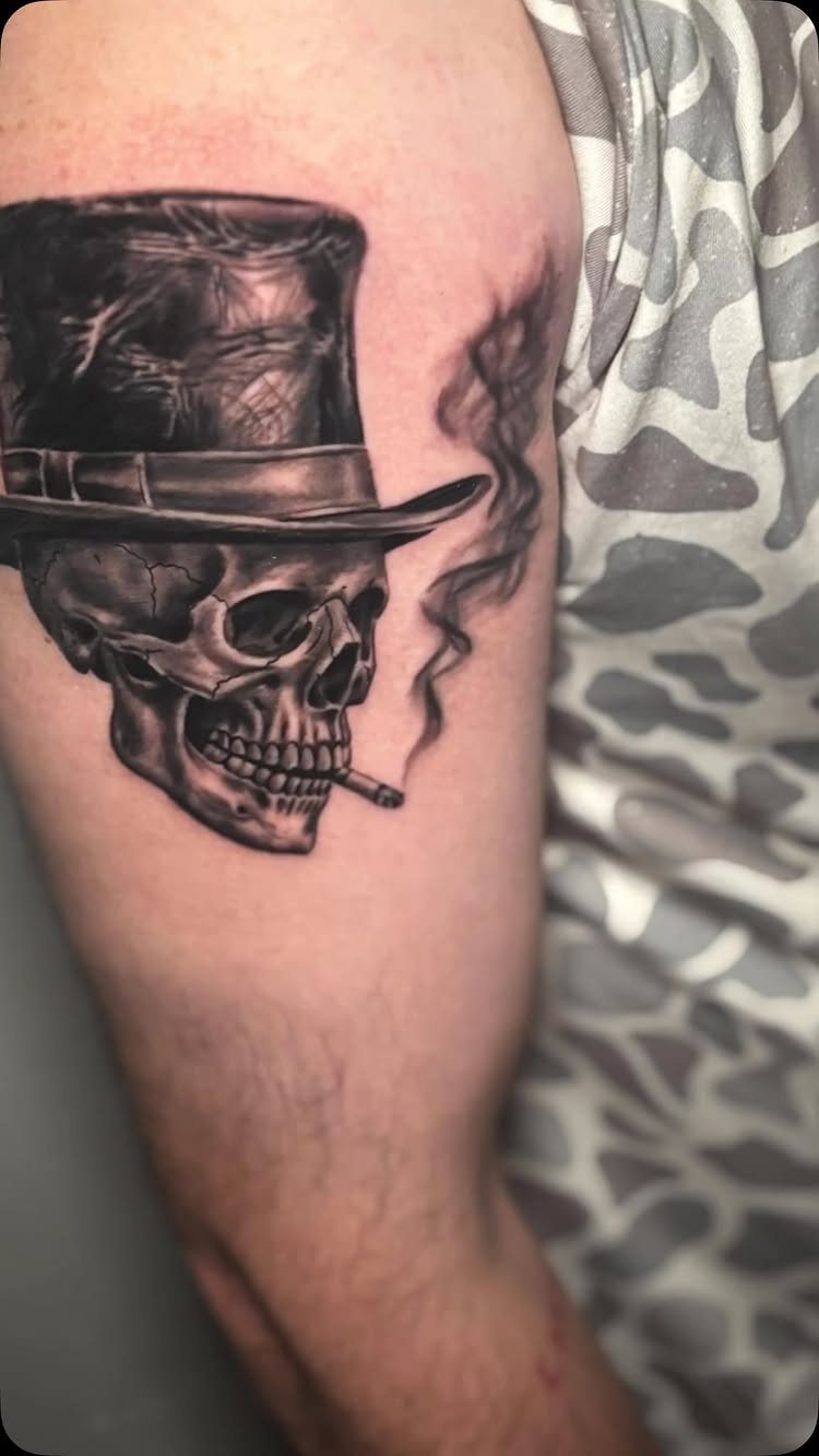
A skull in a top hat splits the difference between Victorian respectability and the memento mori tradition that fascinated the same era.
The hat gives the skull posture, almost personality; the smoke curling from its mouth adds motion to a subject that usually sits still.
Black and grey keeps the formal tone, though I have seen versions with a red silk lining in the hat or a gold watch chain that catch the eye differently.
Either way, the hat’s shape needs to read immediately; too much feather or band detail and it becomes a costume piece.
Single needle or tight grouping keeps the brim sharp.
Placement matters for the silhouette: upper arm or thigh gives the hat enough height, a wrist cramps the proportions. Pair it with a frame of acanthus scrolls or let it stand alone; the skull carries enough weight either way.

【 575+ Fun Assorted Tattoo Stencils 】-The ChurlChurl tattoo stencils collection includes 575 high quality stencils with multiple themes. enjoy cute trendy tattoo stencil designs like butterflies, words, flowers, symbols, totem, Egypt style patterns and more.
4. Ornate Key Designs
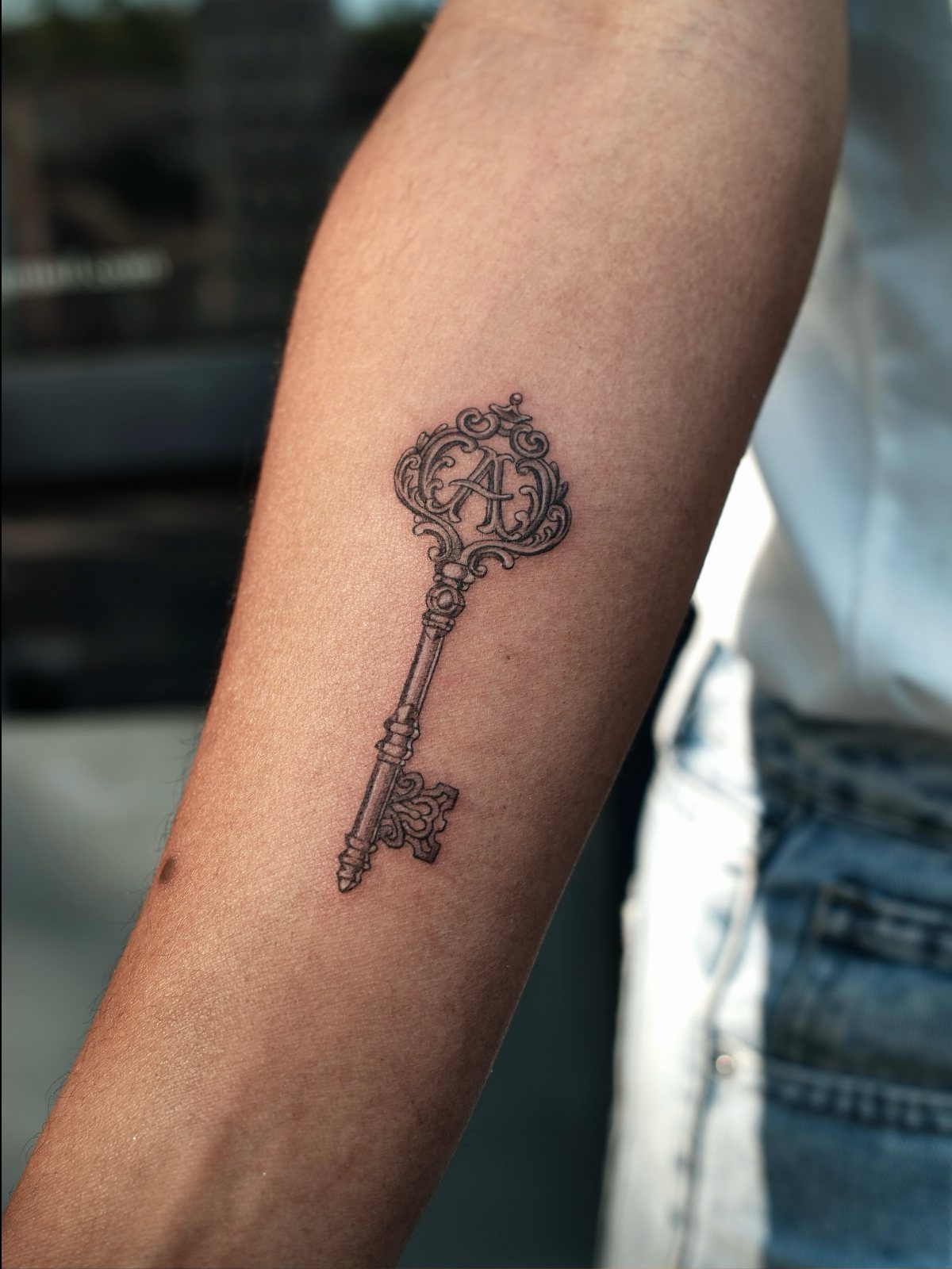
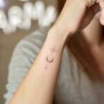
An antique key tattoo works as a lock’s missing half, a promise or a secret depending on how you read it.
The bow, the top loop, is where the artist puts the filigree: scrollwork, a single letter, a tiny stone setting rendered in dotwork.
A single initial makes the key specific to someone.
Without that initial it stays more universal, a found object rather than a personal code. Black ink is standard; the metal sheen is suggested through grey wash, not actual metallic pigment, which ages poorly.
Forearm placement lets the key hang straight. On a rib or a thigh it would tilt with the body’s curve, which some prefer and some do not.
The shaft needs length to show the bit, the part that actually turns; a stubby key looks like a charm, not a working thing.
Go no smaller than a few inches or the teeth blur together. Below that the bit’s teeth blur together.
5. Victorian Lady Portraits
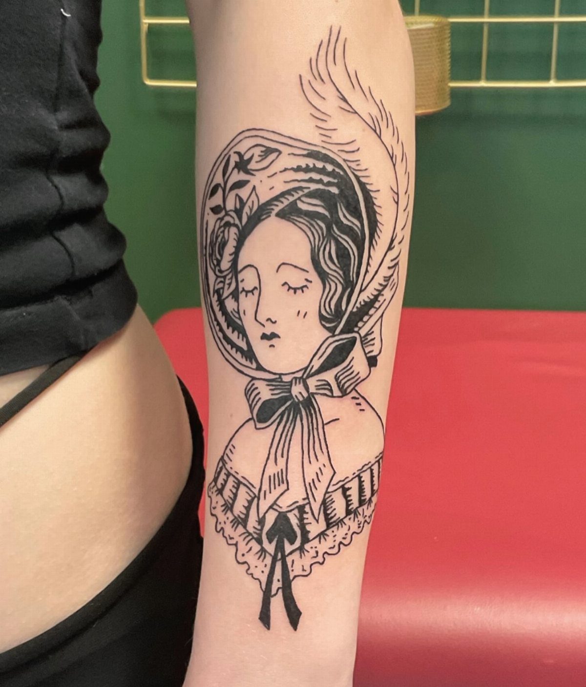
A Victorian lady portrait borrows from the carte de visite photographs that filled albums back then: formal pose, direct gaze, the bonnet and ruffled collar that marked respectability.
The tattoo version keeps that stillness, the sense of someone caught between moments.
The bonnet frames the face and gives the artist a dark shape to work against; the feather or ribbon detail at the crown breaks the silhouette.
Ruffled gowns below the waist are optional, a chance to extend into a larger piece or stop at a bust portrait. Mid-length framing shows the clothing’s era without crowding the forearm.
Black ink suits the source material; these were monochrome photographs after all. A skilled artist can suggest fabric texture through line weight alone, heavier strokes for velvet nap, lighter for lace.
The risk is sweetness, too much period charm and not enough edge. I would ask for something in the eyes, a directness that keeps it from looking like a museum print.
Placement on the outer forearm lets you see her face when your arm hangs naturally. Inner arm reverses the gaze; she looks away from you, which is its own effect.

⯁ 400+ Reusable Henna Stencils: Get 24 sheets of high-quality, self-adhesive hollow templates featuring over 400 unique patterns. These temporary tattoo stencils allow you to create stunning body art including mandalas, butterflies, and dragons. Perfect for practicing techniques without permanence
Color Schemes
Black and grey are the base of most Victorian work, the same tones you see in period photography and engraving.
Burgundy shows up as the single accent color, usually in a lining, a rose, or a ribbon; it reads as aged velvet rather than bright red.
I would keep color minimal. The style depends on fine linework and shading, and color saturation competes with both.
If you want burgundy, one element is enough; spread it across three and the piece starts to look like a color illustration instead of a period object.
Tattoo Placement Advice
Victorian designs need room. The back and shoulders carry large symmetrical pieces well: scrollwork, peonies, filigree patterns that spread across the upper back with space to breathe.
The upper back in particular keeps the design flat while you stand, which matters for symmetrical work; a curved surface throws off the balance.
The forearm works for smaller framed scenes: a candelabra, a vintage landscape in an ornate oval, a decorative floral arrangement. These read at arm’s length, the distance someone actually sees them.
I would avoid joints for the dense black fills common in this style.
Elbow and knee skin heals unevenly, and the solid tones of gothic Victorian work show every dropout. Plan the placement around where the design stays intact, not just where it fits.

183PCS Different Styles Tattoos Stencil: Our temporary tattoo stencils forkids comes with 183 temporary tattoo stencils painting set design such as flowers, cats, hearts, skulls, dinosaurs, fruits, deer, scorpions, Hannah, unicorns, whales, cars, rainbows, telescopes, ships, too fast, astronauts, pirates, letters, stars and more Style in 12 sheets A5 size. Perfect for festivals, parties, or daily fashion.
Design Inspiration
Historical fashion gives the style its figures: the bonnet, the ruffled collar, the pocket watch chain, the top hat.
Architecture supplies the frames and borders, baroque scrolls and filigree that hold the composition together. Nature comes in as peonies, roses, moths, the organic shapes that soften the geometry.
The combination reads as elegant because the elements are balanced: too much architecture and the piece feels like a building facade, too much nature and it drifts into generic floral work.
The gothic edge comes from what you pair, a stopped watch with a moth, a portrait with a candle burning low.
I look for source material in period photographs and engravings rather than other tattoos.
Carte de visite portraits, cabinet cards, iron gate designs from that era: these give proportions and details that have already aged well. Copying a tattoo copy loses that sharpness within a generation.