Word tattoos run from a single initial behind the ear to full song lyrics down the spine, and the right placement depends on whether you want the words seen by strangers, shown only to someone close, or kept entirely for yourself.
The deciding factor is visibility: some spots announce themselves before you speak, while others need a mirror or an intimate moment to be read at all.
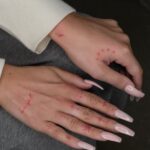
A finger piece sits where only a hand you choose to hold will find it, and that difference in who sees the work changes everything about what you put there.
[link-whisper-related-posts]1. Forearm
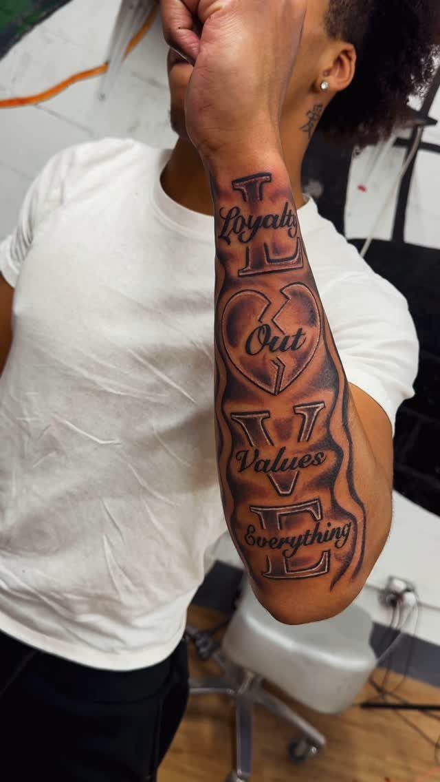
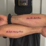
The forearm holds almost any length of text you throw at it. A single word sits clean on the outer side, where the muscle keeps the skin steady and the letters stay readable from across a room.
Full quotes read smoother on the inner forearm, riding the natural line from elbow down toward wrist.
Pain stays moderate here; the muscle padding does real work. That visibility cuts both ways: the outer forearm shows in short sleeves, the inner only when you turn your hand.
Script fonts work, but keep spacing generous.
Skin moves and stretches through the day, and tight lettering blurs faster than you think. I would pick the inner forearm for anything personal, the outer for a statement I want noticed.

Clean, Flawless Transfers: Your artwork will look so clean once transferred to the skin with the Stencil Stuff gel! Gentle on the skin, Stencil Stuff transfer solution helps you achieve clear and sharp tattoo stencil transfers every time!

1 Set = 12 Sheets Henna Tattoo Stencils, 6 Pairs Right and Left hands stencils. Pasting position: Hand, Finger,Forearm, etc. Suitable for Henna tattoo, Airbrush Painting, Glitter tattoo, and so on;

Premium Quality 1.5mm Silicone Material – Crafted from premium 1.5mm thick silicone, this tattoo skin offers a true-to-life feel with excellent durability and a smooth surface for effortless needle movement during practice.
2. Inner Wrist
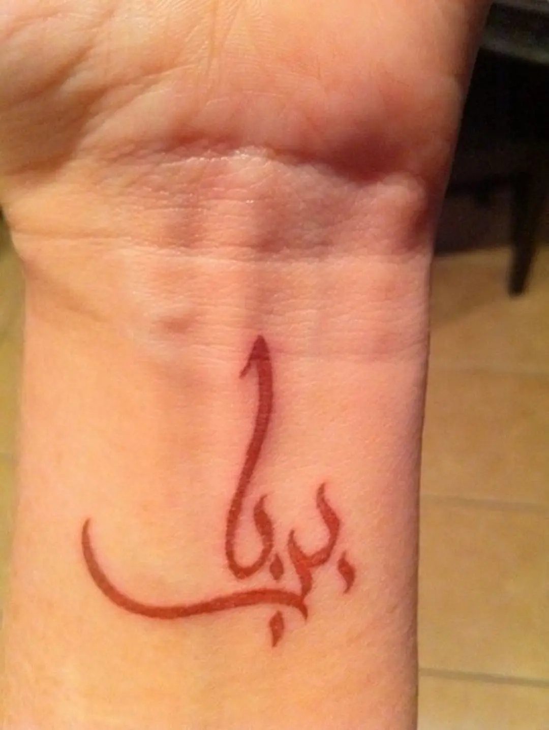
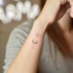
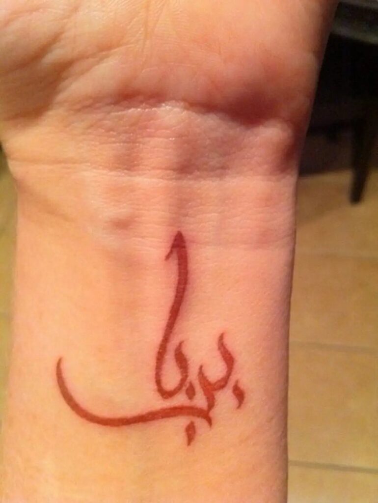
One to three words. That is the wrist’s whole vocabulary, and the constraint is the point.
Thin skin over bone means the needle hits harder here; the ache is sharp and concentrated.
Red ink ages faster than black on this spot, fading to a softer tone while black holds steady. Worth choosing if the meaning matters more than crisp edges long-term.
Horizontal placement reads cleanest.
Vertical or curved text fights the wrist’s own lines and tends to look cramped. A simple, unadorned font wins: the space is small and decoration competes with legibility.
I have seen people treat this as a private reminder they check without thinking, the way you might glance at a watch that is not there.

Inspirational Quotes Words Party Supplies for women - 4.7*2.6 inches 10 sheets 90 Pcs temporary tattoos

Hawink 2 x 8 wrap and 2 x 10 wrap coils tattoo machine for liner and shader.runs faster to create fine and precise line work. has higher power to penetrate deep into the skin, creating vibrant and lasting color.

DIY Temporary Tattoo Kit: The kit includes 10 Bottles of Temporary Tattoo Ink (Cyan, Red, Brown, Orange, Green, Deep Red, Violet, Rose Pink, Black, Blue), 8 Pairs Glove Stencils, 86 Cool Stencils – perfect for creating unique tattoo art and party outfit
3. Collarbone
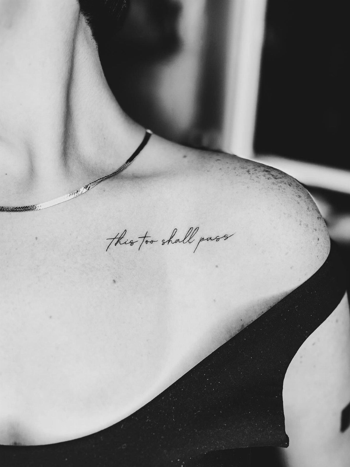
The collarbone frames text like a shelf. Low necklines show it; higher ones hide it completely, which is the whole game for people whose workplace still matters.
Script lettering owns this spot because the bone’s gentle curve wants flowing lines; block fonts sit there like they were dropped, not placed. Pain sits at moderate, though the bone proximity spikes near the center dip.
"This too shall pass" works because the phrase matches the placement’s temporary visibility.
A collarbone tattoo sees daylight when you choose, not by default. I would keep it brief; the available length looks longer than it is, and crowded lettering here ages badly.

Warm Tips: The tattoo transfer paper need to work with transfer medias.You will need to purchase the stencil ointment separately. Apply the design made on the master paper. Please pay attention to press the back side of the pattern to the skin for at least 3 seconds
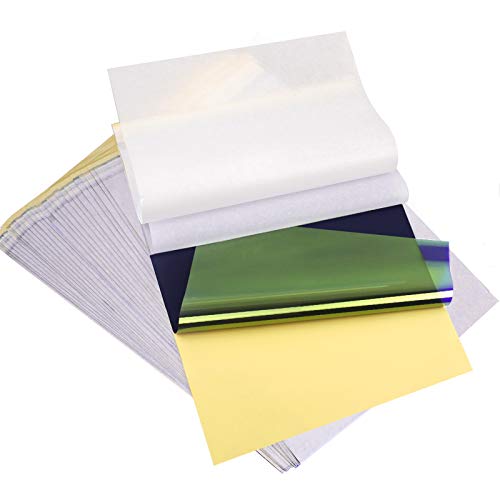
ADVANCED MATERIAL: Tattoo transfer paper is made with the high quality dyes and stencil paper. Transfer marks are very clear, clean and smooth. Tattoo transfer paper kit come with 35 sheets. Great for tattooing, trace and transfer images onto the body.<br>

4-layer Design: The 4-layer design ensures a crisp, clean transfer with sharp lines and fine details. Each layer has a specific function — such as holding the stencil ink, releasing it evenly, and protecting the tattoo paper during storage — which minimizes smudging, prevents distortion, and makes application easier on different skin surfaces.
4. Spine
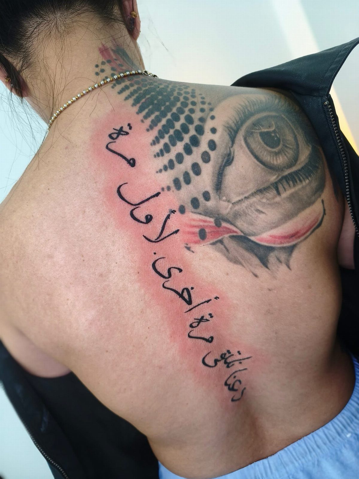
A vertical column down the spine turns text into architecture. The vertebrae give a natural center line, and stacked words read almost like a monument when the back is bare.
The needle rides close to bone for the full length. Pain runs higher here than almost anywhere on the body, and sessions often split across 2 sittings for anything longer than a short phrase.
The result stays hidden from the wearer without a mirror, which filters the motivation: spine words are for meaning, not display.
Song lyrics and longer quotes fit where they would crowd other placements. The skin along the spine moves less with age than joints or the waist, so lettering stays truer over decades if the initial work is clean.

Package Includes: You will receive 20 sheets reusable tattoo stencils, enough quantity to meet your daily requirements. The mehndi stencils are suitable for airbrush painting, glitter tattoo, and so on.

REUSABLD VARIETY OF OPTIONS - This set of temporary tattoo stencil includes 123 different patterns for adult,male. Scorpion tiger dragon cow eagle skeleton Tribal Symbols geometric design etc patterns in 20 pages A4 size, Almost unlimited creative combinations and options to meet your every need.

183PCS Different Styles Tattoos Stencil: Our temporary tattoo stencils forkids comes with 183 temporary tattoo stencils painting set design such as flowers, cats, hearts, skulls, dinosaurs, fruits, deer, scorpions, Hannah, unicorns, whales, cars, rainbows, telescopes, ships, too fast, astronauts, pirates, letters, stars and more Style in 12 sheets A5 size. Perfect for festivals, parties, or daily fashion.
5. Ribcage
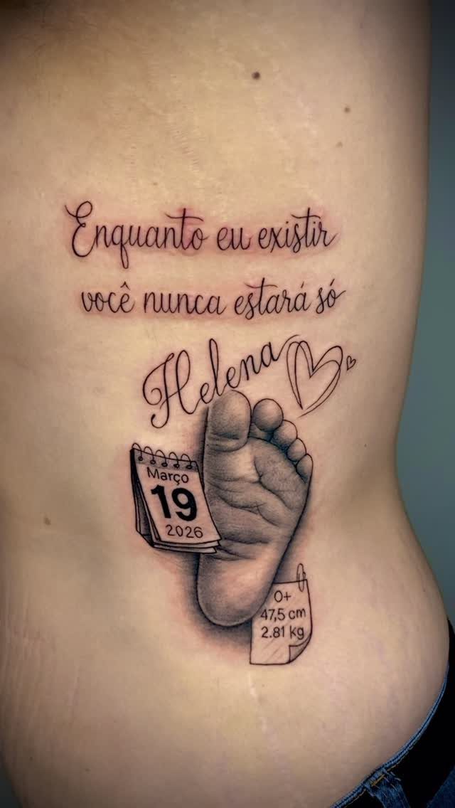
Ribcage skin sits thin over bone and draws the breath’s constant motion, which makes this spot intimate by default; the tattoo moves with you, literally.
Portuguese text paired with a baby’s footprint suits the ribcage because the placement already signals personal weight.
Longer quotes work here where flatter planes would read them as signage instead of skin. The trade is pain: the needle passes repeatedly over floating ribs and the intercostal gaps, and the sensation stays active through the session.
I would plan clothing carefully for the healing weeks. The ribcage rubs against bras, waistbands, and seatbelts, and fresh ink needs minimal friction to settle clean.

Massive Quantity: 60 Sheets in total of fake temporary tattoo stickers, including 30 sheets of inspirational and motivational quotes and scripts, cursive words, retro typewriter style sayinging, 30 sheets of simple branch flower tattoos. Enough for friends party gatherings to enjoy together or choose different pattern to match your everyday mood.

BOLD BODY ART is at your fingertips with hawink Skin Markers. Create vibrant temporary tattoos to complement cosplay outfits, Halloween costumes. Includes easy-to-use stencils. TEMPORARY TATTOO KIT includes 10 skin-safe body art pens and 56 large temporary tattoo stencils. Create eye-catching body art with a rainbow of tattoo marker pens that are skin-friendly.

【 622+ Fun Assorted Tattoo Stencils 】-The ChurlChurl tattoo stencils collection includes 622+ high quality stencils with multiple themes. enjoy cute trendy tattoo stencil designs like butterflies, words, flowers, symbols, totem, Egypt style patterns and more.
6. Upper Back Tattoo Placement for Words
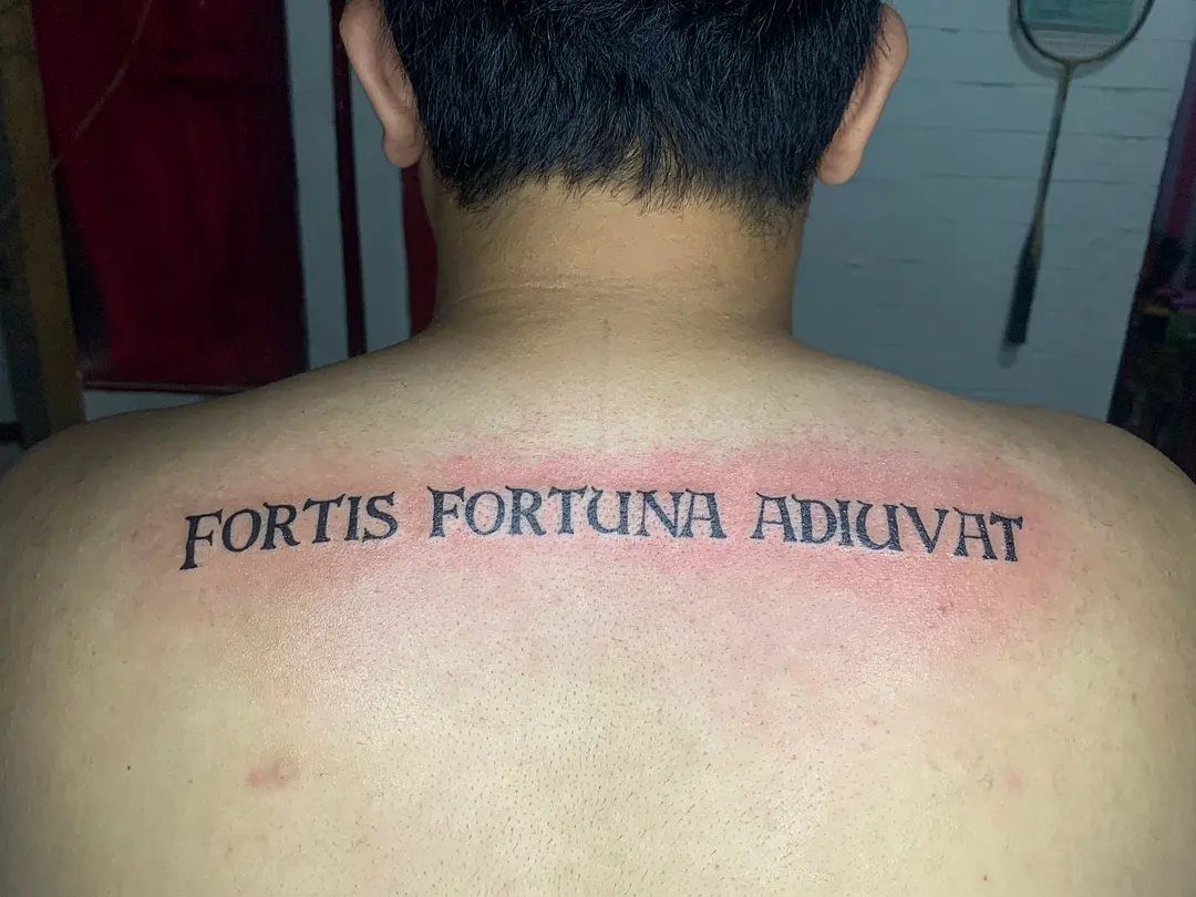
Latin across the shoulder blades reads formal, almost carved, because the broad flat surface holds block lettering steady.
The upper back offers less length than the spine but more width, so horizontal phrases work better than vertical stacks.
Shoulder movement does mean the skin shifts more than the chest or forearm; a font with slightly heavier line weight survives that motion longer than hairline script.
Check your mirror habits before committing. This spot hides under a shirt, shows in a tank top or open back, and needs someone else to photograph cleanly once healed.

Product Kits: You will receive 12 A4 sheets featuring 142 unique henna tattoo stencils patterns including butterflies, flowers, words, symbols, totems and egyptian designs. Our versatile temporary tattoos adult with stencils collection offers something for every taste with its wide variety of artistic models.

Double Sided Tattoo Practice Skin: easy wipe, 2 sides designed fine line tattoo practice skins feature over 20 different stencil designs.
7. Chest
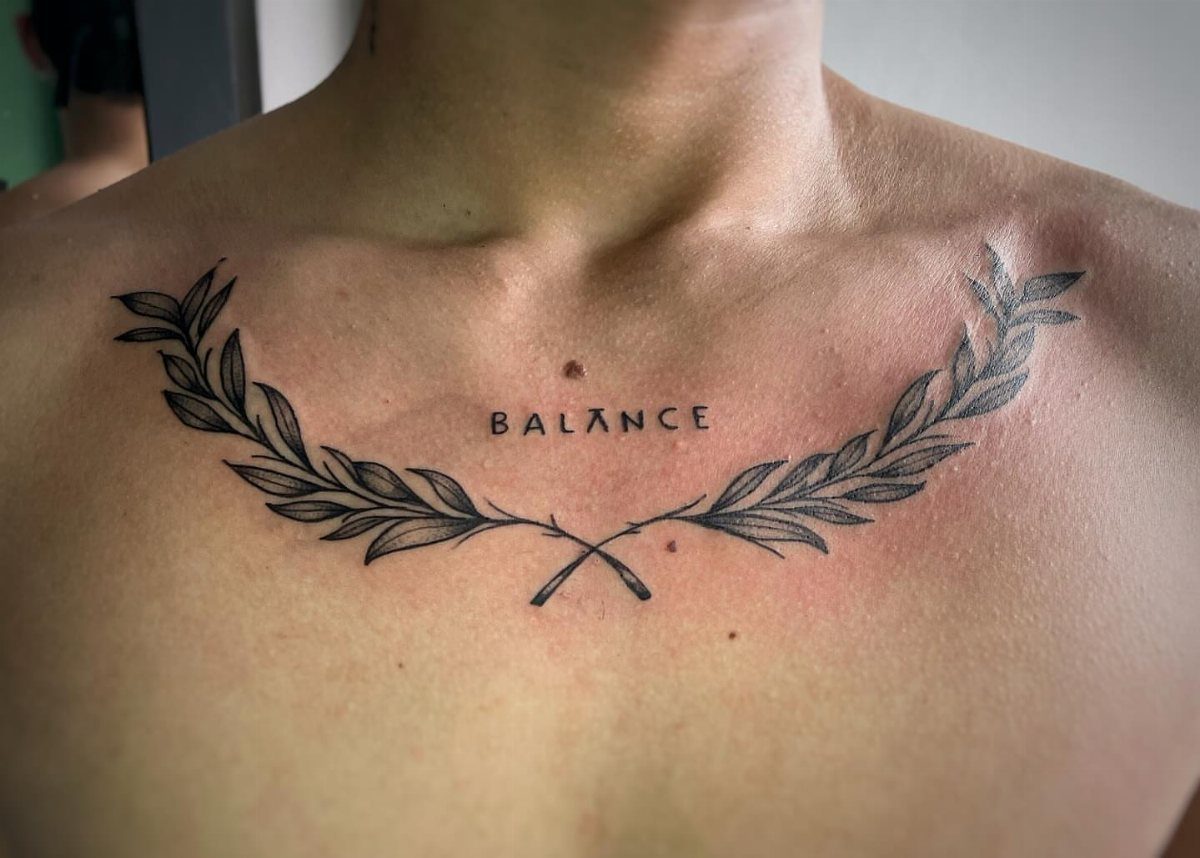
The chest carries words close to the heart, literally.
A single word centered over the sternum reads like a private creed you carry into every room, while a phrase set to one side of the pectoral feels more like a letter you wrote to yourself.
Block and print fonts hold steady on this broad surface; the flat plane keeps letters from warping.
Script works too, but only at smaller sizes where the curves stay controlled. Pain splits across the area: the outer pectoral sits moderate, while the sternum itself spikes sharp with each pass near bone.
I would keep the text brief. The emotional weight of this spot multiplies with clutter, and a single strong word often lands harder than a sentence.

✿【Inspirational Christian & Bible Theme Design】: Our temporary tattoo stickers feature elegant and classic religious elements, including delicate crosses, bible verses, angel patterns, faith symbols and sacred totems. Each minimalist and stylish design carries positive spiritual meaning, representing faith, hope, blessing and peace. these subtle and graceful patterns are suitable for all ages and genders. They are perfect for decorating your wrist, forearm, collarbone, shoulder and hand.

There are 4 Pro tattoo machine gus for liner and shader

✿【Inspirational Quotes Tattoo】: 9 Sheets in total of fake temporary tattoo stickers, including 9 sheets of inspirational and motivational quotes and scripts,words, retro typewriter style sayinging, Enough for friends party gatherings to enjoy together or choose different pattern to match your everyday mood.
8. Bicep Tattoo Placement for Words
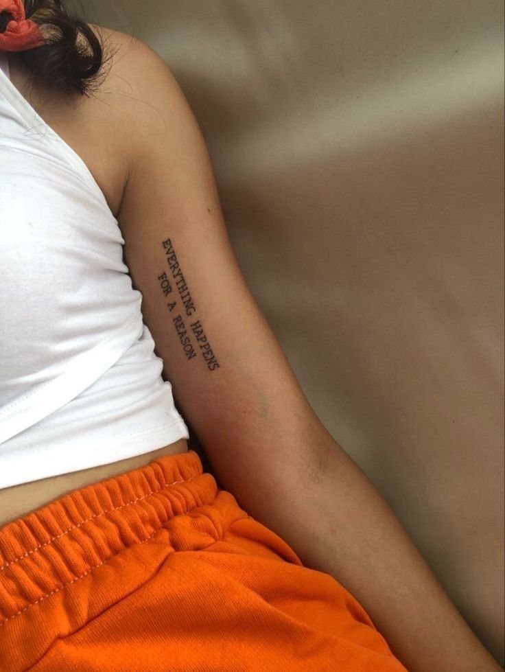
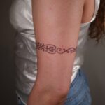
The inner bicep hides text against the body unless the arm lifts or sleeves roll back, which makes the reveal intentional.
Vertical placement runs the natural line of the muscle, though horizontal reads easier when the arm hangs at rest.
The skin here shifts with every curl and reach, so line weight needs to be slightly heavier than you would choose for a forearm.
A serif font in black ink, sized to read at arm’s length, survives that motion better than hairline script.
Pain stays moderate through most of the inner arm, spiking near the armpit where skin thins and nerves cluster. Plan for healing against torso friction; the inner bicep rubs with every arm swing until the skin settles.
But the text itself is only half the equation. Word tattoo placement is the other half, and it is a decision that shapes everything about how your tattoo looks, feels, functions, and lasts over the years.

1. Safe and Healthy: Meet rigid safety and non-toxic materials standard, no irritation to the skin. Plus, It also has Clean Dry Protection Skin antiperspirant and deodorant functions.


CREATED BY ARTISTS FOR ARTISTS: Hand-drawn designs enable both beginners and experts to achieve stunning custom creations. EASY APPLICATION: Transfer designs quickly and easily to create one-of-a-kind sneaker art in just seconds! DESIGN VARIETY: Each set includes 4 sheets, containing over 200 unique designs for customizing your sneakers, handbags, apparel, and more!
9. Neck
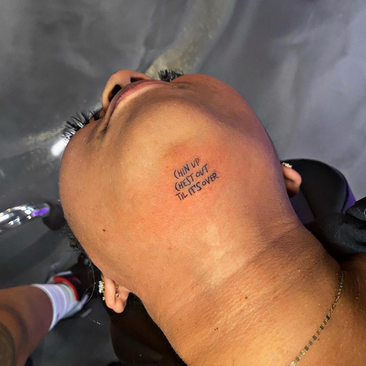
A neck tattoo announces itself before you speak. Short phrases work here; long ones wrap awkwardly and fight the throat’s natural lines.
The sides and back of the neck hide under a collar or growout when you want them gone, which is the main reason people risk this bold placement.
Under the chin, visible only when the head tilts back, plays a different game: seen in specific moments, not by default.
Pain runs sharp near the spine and softer toward the sides, though the whole area carries a reputation that keeps first-timers away.
The skin here ages fast with sun exposure, so black ink holds longer than color, and touch-ups come sooner than on the torso.
I would reserve this for words I want to own completely, not ones I might explain to a stranger.

⯁ 400+ Reusable Henna Stencils: Get 24 sheets of high-quality, self-adhesive hollow templates featuring over 400 unique patterns. These temporary tattoo stencils allow you to create stunning body art including mandalas, butterflies, and dragons. Perfect for practicing techniques without permanence

【 575+ Fun Assorted Tattoo Stencils 】-The ChurlChurl tattoo stencils collection includes 575 high quality stencils with multiple themes. enjoy cute trendy tattoo stencil designs like butterflies, words, flowers, symbols, totem, Egypt style patterns and more.

[Tattoos Stencils Kit]: 20 sheets (3.74’’*7.28’’ each) total 210pcs more mixed-size pattern stencil tattoos. Which featuring floral, butterflies,moons,tribal motifs,elephants and more patterns designs,enough quantity and different pattern for you create your tattoos style.
10. Behind the Ear
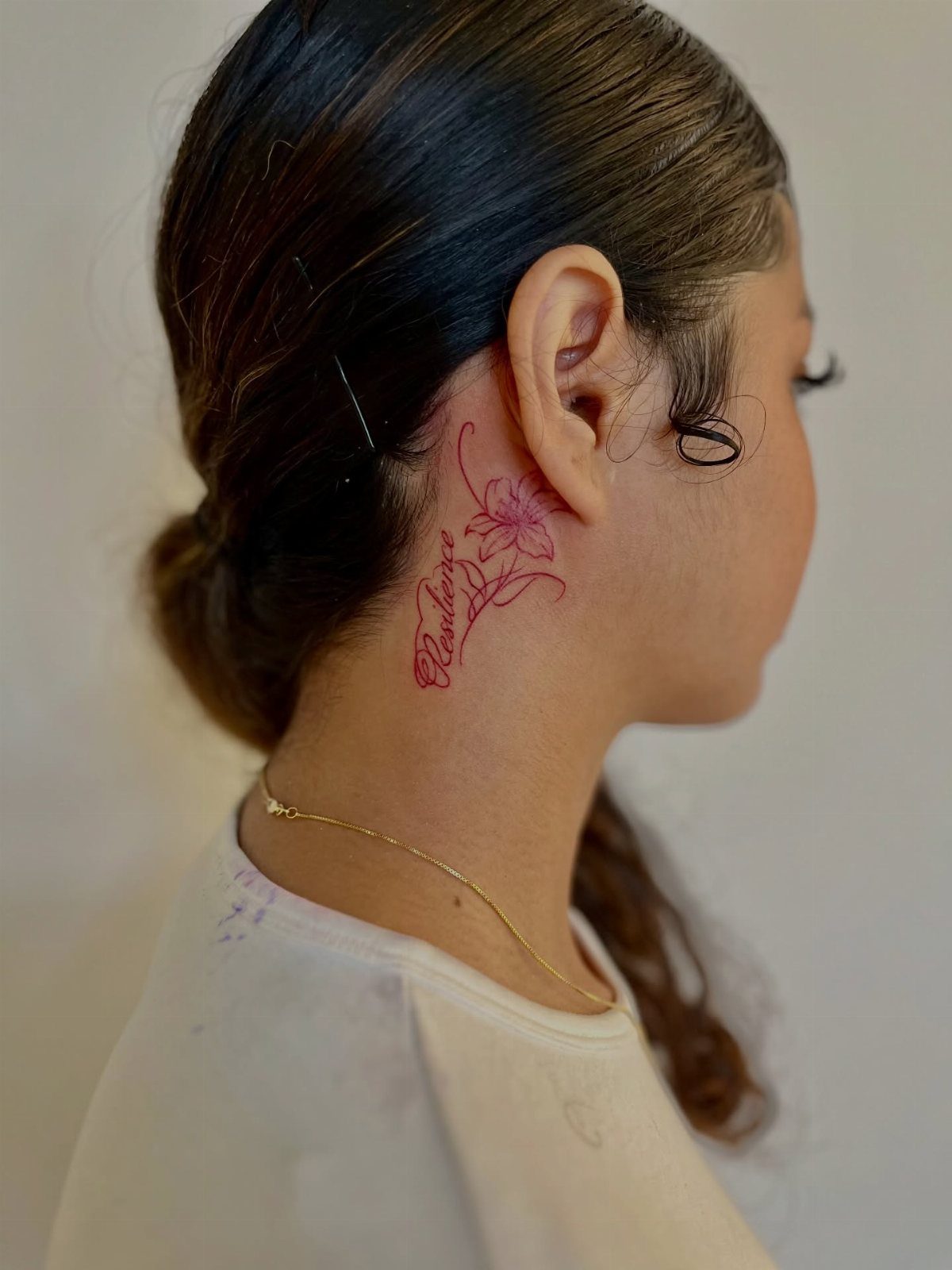
Behind the ear holds a word like a secret told at close range. The space is narrow, so single words or initials fit where longer text crowds and blurs.
Fine line script matches the delicacy of the spot; heavy fonts look dropped onto skin too thin to carry them. The needle passes near cartilage and the skull’s edge, so the session stays brief by necessity, not just choice.
Hair covers the work completely when you want, and the placement only shows when the ear is exposed or the head turns.
Red ink ages differently here than black, softening faster where sun and shampoo reach. I would choose black for longevity or accept the fade as part of the tattoo’s life.
97 HENNA TATTOO DESIGNS IN 18 SHEETS:Includes 8 hand stencils, 8 rectangle flower pattern sheets, and 2 small pattern sheets. Features butterflies, flowers, roses, mandalas, paisley, and traditional Indian/Arabian mehndi designs. Perfect for creating stunning body art for weddings, festivals, and summer celebrations.

24PCS Unique Henna Stencil Pack – This complete henna tattoo kit accessory set includes 24 sheets of reusable mehndi stencils (6.89" x 3.34"). Featuring exclusive designs like long arm bands, moon motifs, vine flowers, and large floral templates, it is ideal for creating DIY temporary skin art on wrists, arms, back, and full body.

Variety Pack: This henna tattoo stencil kit includes 12 sheets of intricate and detailed temporary tattoo templates inspired by Indian designs.1 Set = 12 Sheets Henna Tattoo Stencils, 6 Pairs Right and Left hands stencils. Pasting position: Hand, Finger,Forearm, etc. Suitable for Henna tattoo, Airbrush Painting, Glitter tattoo, and so on;
11. Thigh
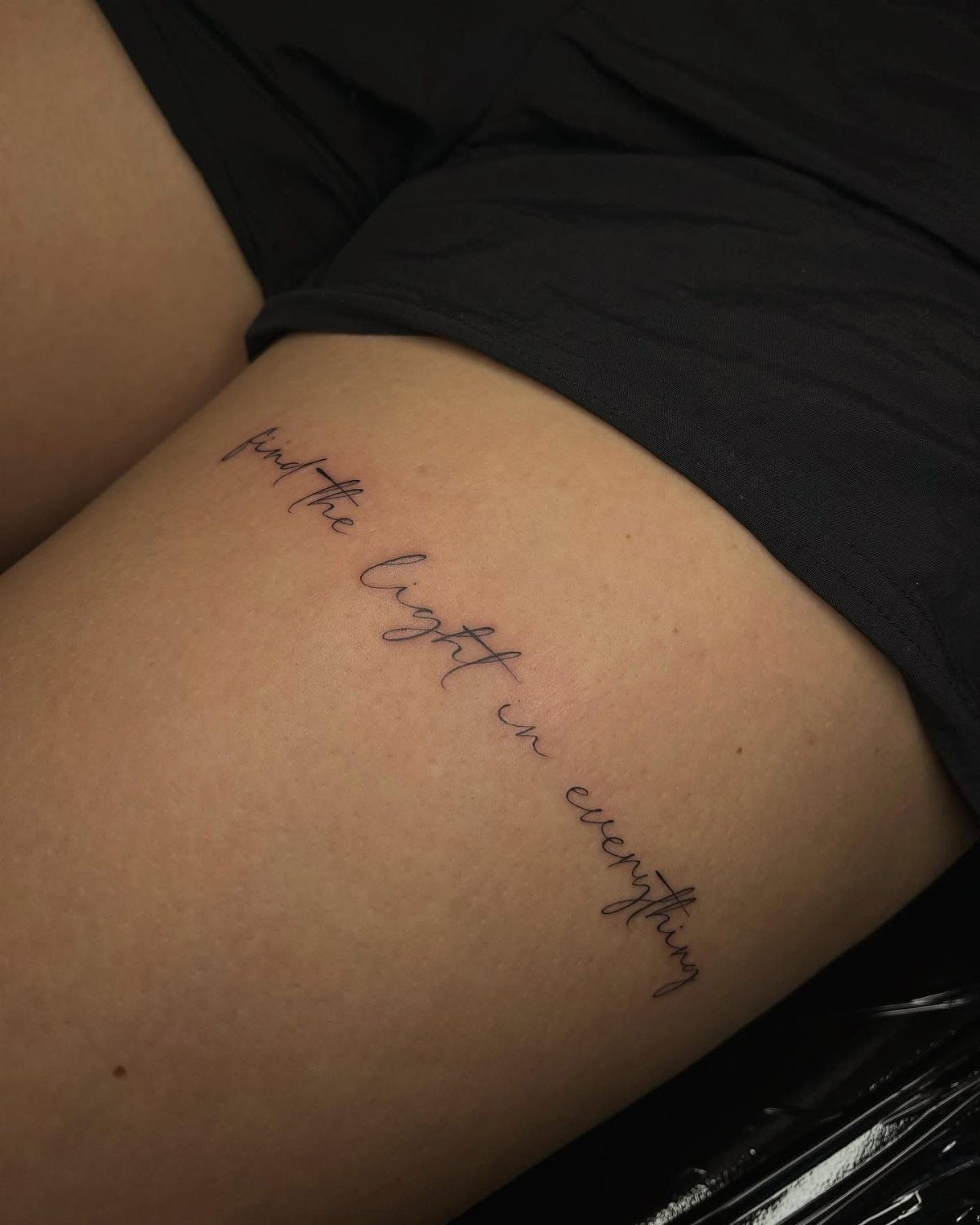
Thigh skin offers room for full sentences that would crowd anywhere else. A phrase like "find the light in everything" sits below the hemline, visible in shorts or swimwear, hidden under work clothes.
The upper thigh carries more padding than bone, so pain stays moderate through most sessions. Cursive script flows with the muscle’s natural line, though the inner thigh warps more with movement than the outer.
Plan for longer healing against denim and seams; the spot rubs with every step if the work sits low enough to catch pants.
I would place text high on the thigh, where skin shifts less and the words stay true through weight change. Lower placement risks stretching that turns letters uneven over time.
12. Ankle
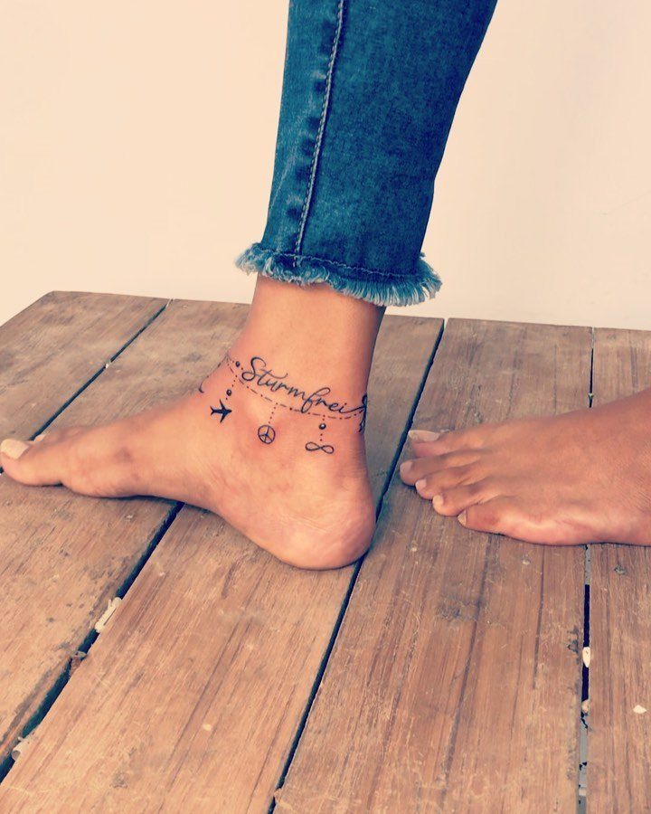
Ankle tattoos read like jewelry you cannot remove. A single word or small symbol wraps the bone, visible with sandals, gone with boots.
The skin here is thin over tendon and bone, so the needle’s vibration travels dull and constant.
Sessions stay short because the area is small and the sensation wears on you fast. Script in a fine weight suits the delicacy of the placement; bold fonts overwhelm the narrow circumference.
Healing demands patience.
The ankle flexes with every step, and socks or shoe backs rub fresh ink raw. I would plan a week of open shoes or stay home if the season allows.
A word chosen here should matter enough to carry through the discomfort, because the ankle earns its ink slowly.
13. Finger
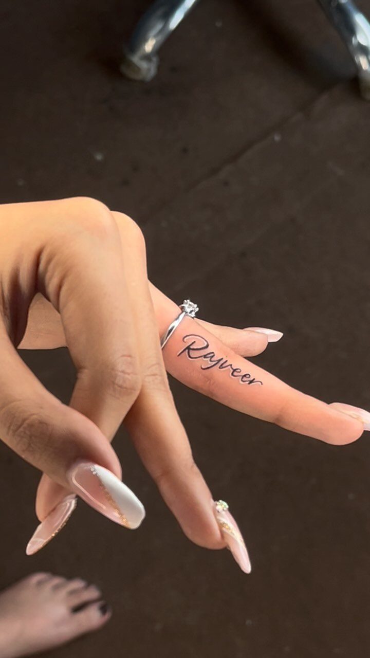
A finger carries a word like a signature you never wash off. "Rajveer" along the inner index finger sits where only the wearer and someone close enough to hold hands will read it.
The space is minimal: one word, maybe two short syllables, before crowding turns to blur.
Cursive flows with the finger’s length; block letters read as code, not poetry. The real cost here is maintenance.
Fingers spend their days in water, against keyboards, gripping steering wheels and door handles. Ink fades faster on fingers than anywhere else on the body, and touch-ups are not an exception; they are part of the commitment.
I would choose black over color, a single meaningful name or date, and accept that the tattoo will soften into a whisper of itself. Couples sometimes match a shared word here, though both should know the upkeep ahead.
14. Foot
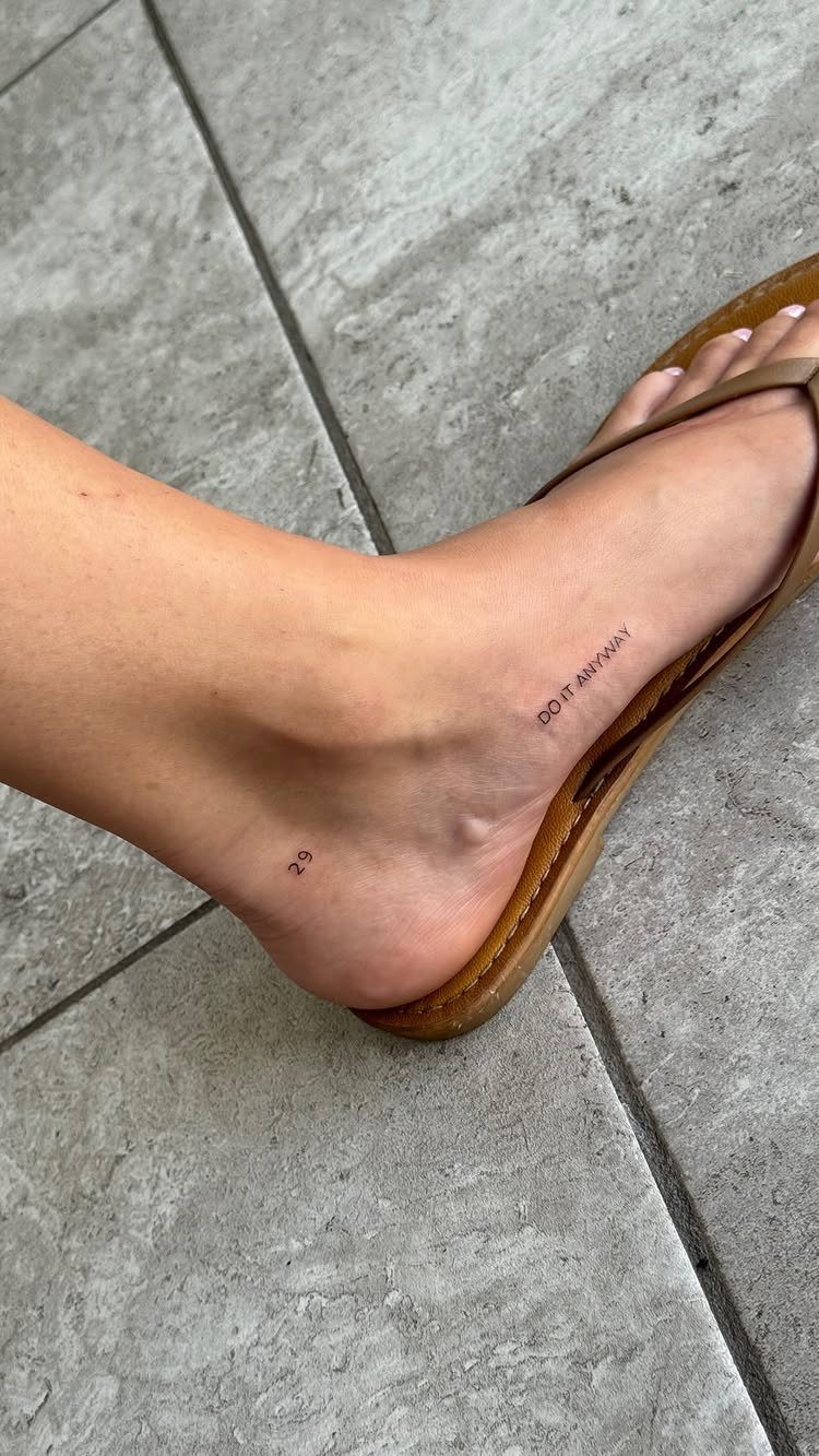
Words along the foot’s edge ground themselves in the body’s lowest point. "DO IT ANYWAY" reads like a private command issued with every step forward.
The lateral side offers a natural line for horizontal text, visible in sandals, invisible in boots.
Shoes, socks, and pavement all rub this spot raw through the day, so a foot piece fades faster than work tucked under a sleeve and aftercare has to be stricter from day one.
I would plan a week of open footwear for healing, and expect earlier touch-ups than a torso piece demands.
15. Lower Back
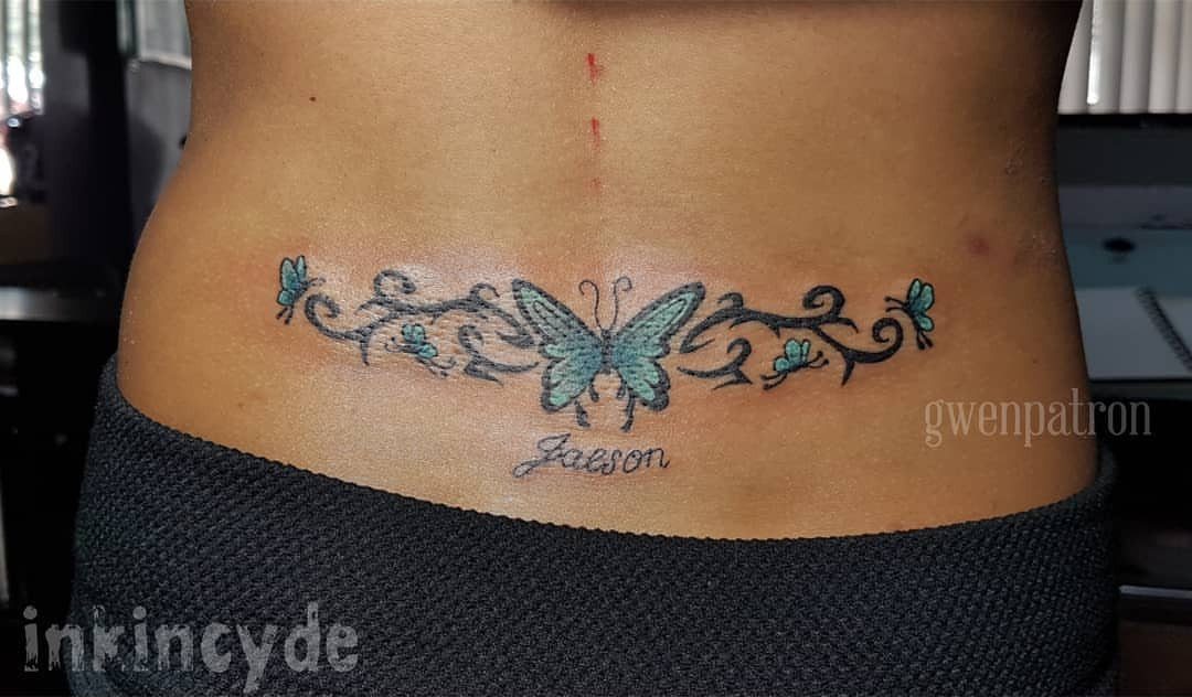
The lower back holds horizontal text like a banner across the body’s widest lower plane. A name like "Jaeson" beneath scrollwork sits where jeans hide it and low waistbands reveal it, the visibility entirely yours to control.
This placement hit its stride a few decades back for good reason: the flat surface suits longer phrases that would curve awkwardly on an arm or leg.
Script and decorative flourishes both work; the width accepts ornament without crowding the letters themselves.
I would keep text centered and horizontal; vertical stacks or off-center placement fight the body’s natural symmetry and read as mistakes. The spot heals easily, protected by clothing, though sitting puts pressure on fresh ink for the first week.
16. Hip
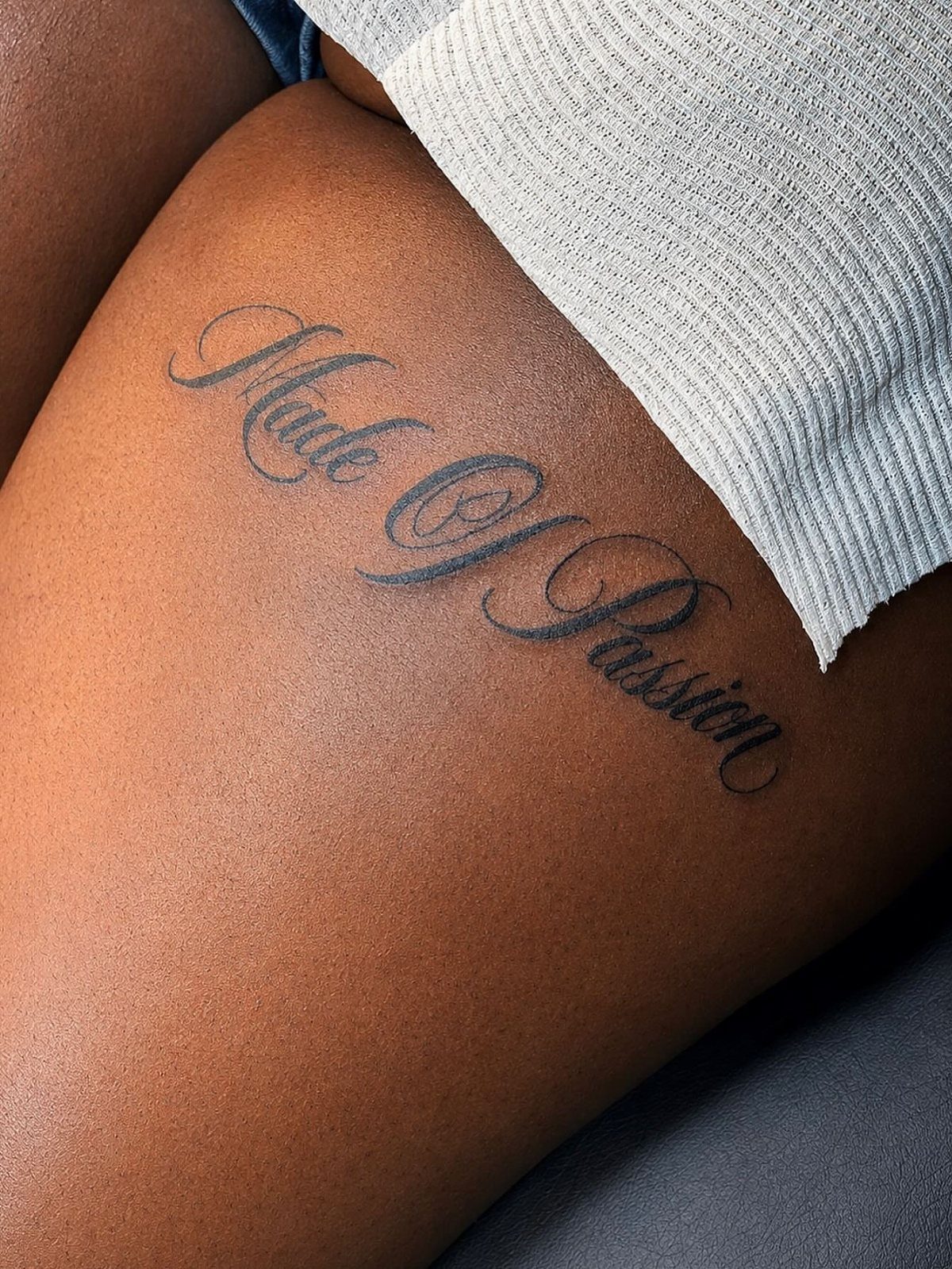
"Made Of Passion" curves along the hip where torso meets thigh, a placement that reads in mirrors and intimate moments rather than daily glances.
Cursive script follows the hip’s natural line better than block text, which would sit like a label on a jar.
The spot hides under waistbands and shows at the beach, which suits words meant for personal significance rather than public display.
Pain spikes near the hip bone itself and softens toward the outer thigh.
Healing demands loose clothing; jeans and fitted waistbands rub fresh ink raw. I would place text high enough to clear underwear elastic and low enough to stay clear of the waist’s natural fold, where skin creases most.
Frequently Asked Questions
What is the best placement for a word tattoo?
The best placement depends on how long your text is and how visible you want it. Short words fit compact spots like the wrist, behind the ear, or a finger.
Full sentences need the thigh, back, ribcage, or spine where the text has room to stay readable. Match the scale of your words to the scale of the placement, and consider whether your workplace allows visible ink.
What’s the most painful tattoo placement?
Vertical script down the spine means the needle stays near bone from neck to tailbone, which most people rate as the worst pain they have felt in a chair. The outer forearm and upper thigh stay moderate by comparison.
What is the rule for tattoo placement?
Match your text length to the space available, and choose visibility based on your daily life. Compact spots suit a single word; a full quote needs room to spread out.
If your job restricts visible tattoos, the thigh, ribs, spine, and hip stay hidden under clothes. If you want to see the words yourself, the forearm, collarbone, or wrist puts them in your line of sight.