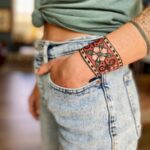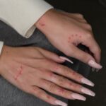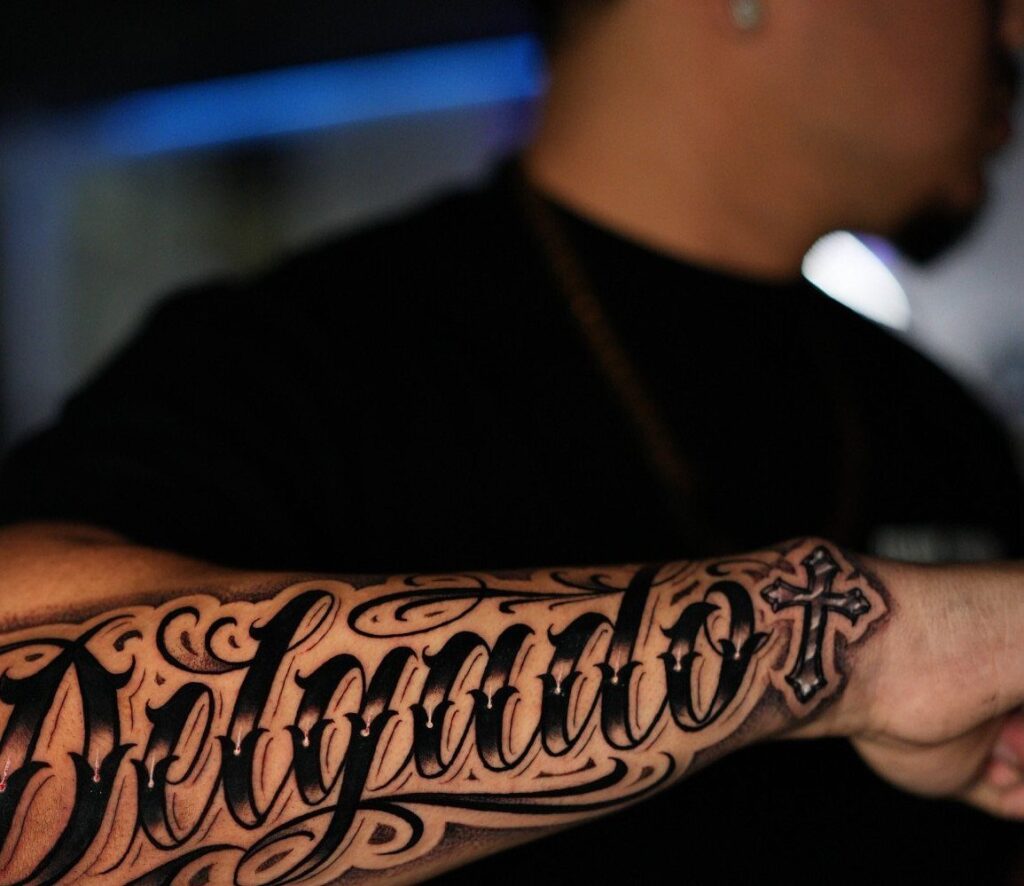
Script fonts flow like handwriting, block letters read from a distance, and the 8 styles ahead run from delicate hairlines to heavy blackletter that fills a chest.
Old school fonts carry weight without shouting, fine line lettering asks the viewer to step closer, and each style in this list handles aging and sunlight differently.
[link-whisper-related-posts]1. Script Fonts
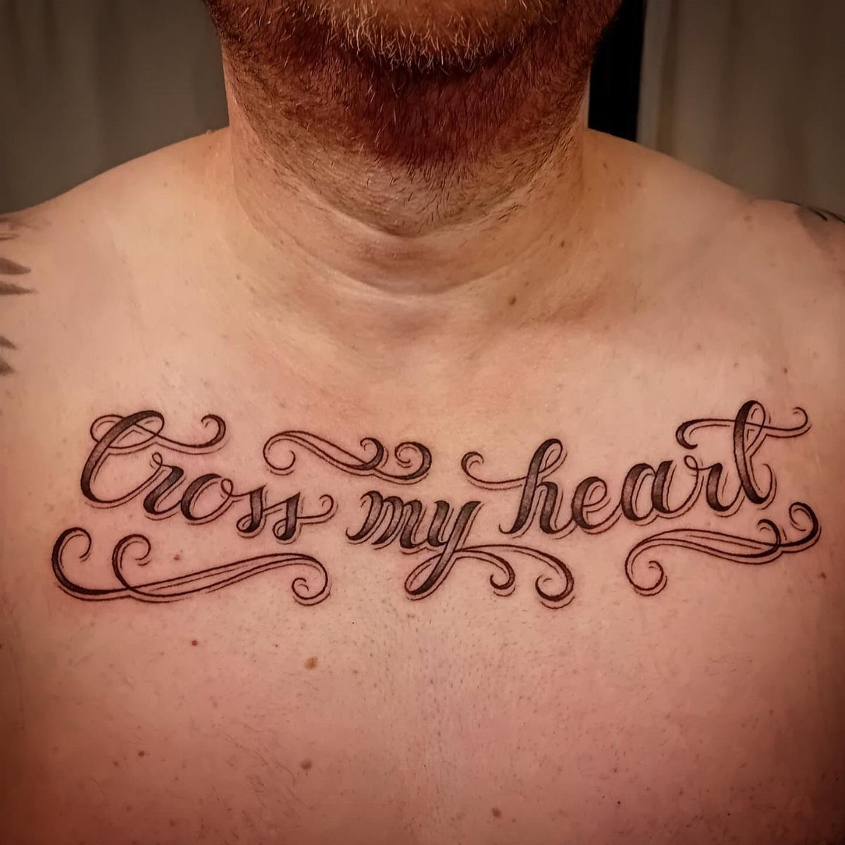
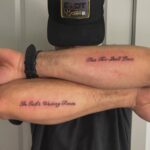
Script fonts live somewhere between handwriting and architecture, each letter connected to the next by a planned stroke that still looks like it flowed from a pen.
The thickness changes deliberately, thin upstrokes against heavier downstrokes, which keeps the words readable even as they curve across a collarbone or wrap a forearm.
I like this style for short phrases that matter to the person wearing them, not full paragraphs that turn into a blur from across the room.
A single word or a handful of words sits best. Ask your artist to draw the spacing loose enough that the letters do not clot together as the ink settles over the years.

【Package Includes】: You will receive 65 pieces painting stencils totally, including 26 uppercase letters, 10 numbers, 26 lowercase letters, 4 styles symbol stencils. These will give you endless possibilities of customized words to create any DIY art projects as you like. More than that, all the characters have a stylish, calligraphic, cursive, and very pleasant font. (Stencils Font size: 2 inch).

30 Pcs Stencils Set: there are 30 pieces letter stencils for painting in our package, they are designed with different styles and sizes of letters, numbers, and symbols, which can help you create your own diary and plan style; Please handle the stencil with care; Avoid rubbing against the sharp edges to prevent scratching your hands

What you can receive: there are 8 pieces of alphabet letter stencils, which are available in 4 different fonts, and each font includes capital letters, lowercase letters, numbers and punctuation; The abundant quantity and various styles can efficiently satisfy your painting needs in daily life
2. Block Letters
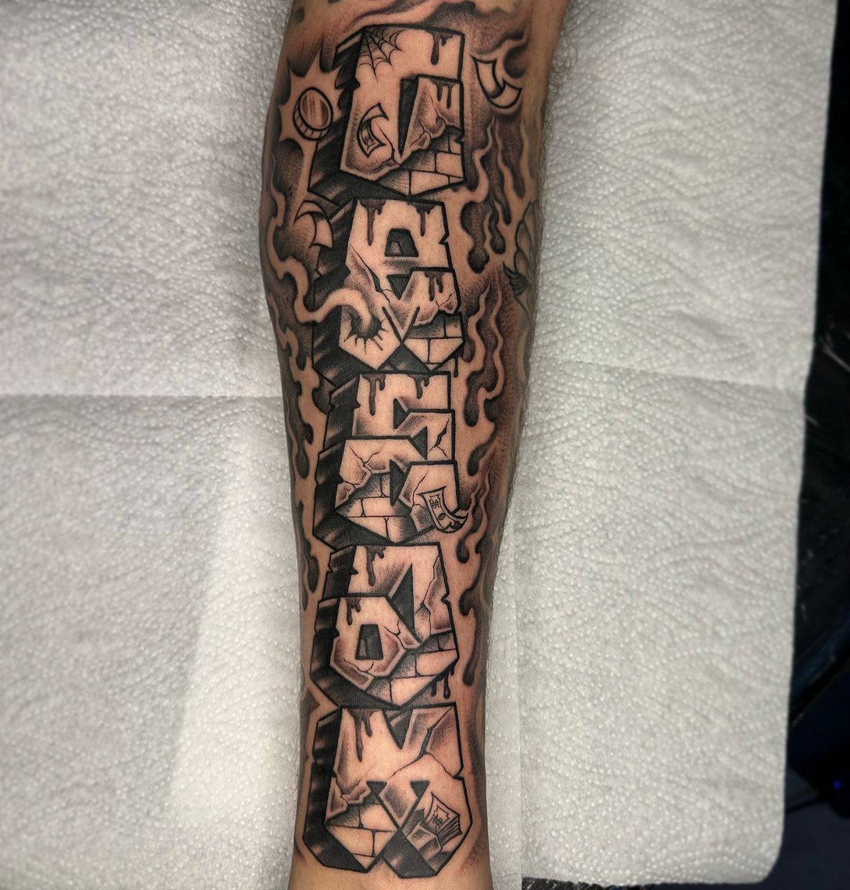
Block letters announce themselves before you are close enough to read the words.
Sharp edges and geometric planes carry weight that script cannot match, and pushing the style into 3 dimensions with stone-brick texture is possible if your artist has the skill.
Shadows are the usual move for depth, either dropped to one side or carved in as negative space.
I would check that the artist has healed photos of similar work; heavy black fill can fall out unevenly if the saturation is rushed. This style suits a statement you want readable across a room, not a private reference.

MADE IN THE USA SINCE 1990: For over 30 years Dynamic Color has produced professional tattoo ink in the United States, an established American brand artists built their work on long before most imported labels existed.


Bold gothic statement for tattoo lovers, ink addicts, and blackletter typography fans. Perfect for artists, rebels, and anyone living the inked lifestyle with pride and attitude.
3. Decorative Numerals
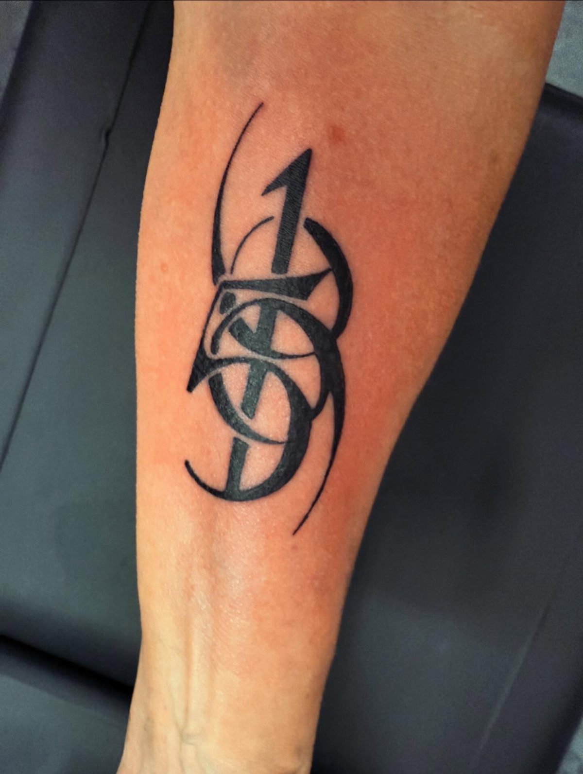
Numbers rarely get their own category in tattoo conversations, which is a mistake.
A birth date, an anniversary, a jersey number, these carry as much weight as any quote, and the ornamental flourishes here let them hold a whole forearm without looking like an afterthought.
The thick strokes anchor the design while the fine lines add movement. I have seen this done as a single digit blown large or as a full date strung together with the flourishes linking each number like a chain.
A vertical banner shape is one way to frame it; another is letting the numbers spiral around an existing piece.

3 Colors: the plastic letter stencil is featured with 3 different colors, red, blue and yellow, classic and elegant, you can choose your favorite one to create delicate handicrafts; Note that the size of the letter template is the size of the outer frame, not the size of the letter itself, please look at the picture size before buying

Premium Quality 1.5mm Silicone Material – Crafted from premium 1.5mm thick silicone, this tattoo skin offers a true-to-life feel with excellent durability and a smooth surface for effortless needle movement during practice.

【Quality Material and Safe Letter Stencils】: These alphabet stencils are made of high-quality eco-friendly PET material, sturdy for you to use, and not easy to break. No sharp edges, safe for you.
4. Graffiti Style
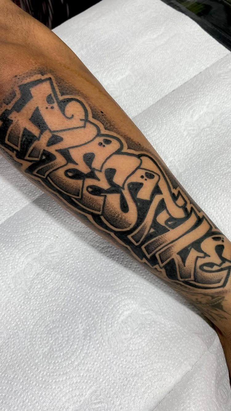
Graffiti lettering borrows from walls and freight cars, and the drips and bold outlines are not mistakes, they are the point.
The style reads as immediate, like the paint just landed. Color is common in this style, though healed work in black and grey ages cleaner on skin that sees sun.
The outlines need to stay crisp; a blown line here kills the whole effect.
I would plan for a longer session than a simpler style, since the fill and the background shading both take time. This one is for someone who already lives in clothes and a posture that can carry it.

【 575+ Fun Assorted Tattoo Stencils 】-The ChurlChurl tattoo stencils collection includes 575 high quality stencils with multiple themes. enjoy cute trendy tattoo stencil designs like butterflies, words, flowers, symbols, totem, Egypt style patterns and more.

▶ Henna Tattoo Kit: 16 sheets tattoo stencils. airbrush tattoo stencils suitable for tattoo lovers. Experience the effects of tattooing without the pain of tattooing.

⯁ 400+ Reusable Henna Stencils: Get 24 sheets of high-quality, self-adhesive hollow templates featuring over 400 unique patterns. These temporary tattoo stencils allow you to create stunning body art including mandalas, butterflies, and dragons. Perfect for practicing techniques without permanence
5. Gothic Calligraphy
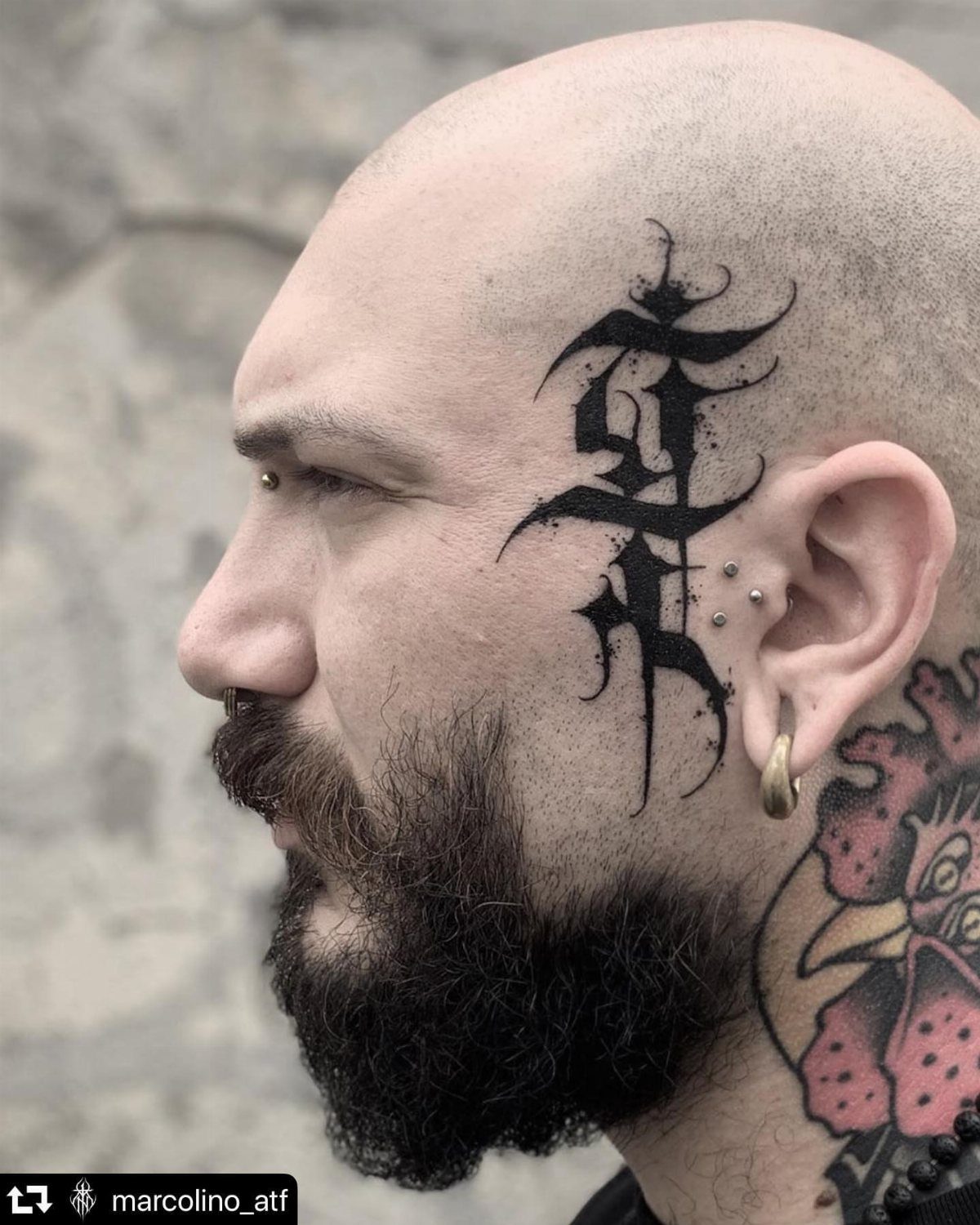
Gothic calligraphy carries history in every sharp angle and flowing flourish, the kind of lettering that filled manuscripts before it reached skin. The heavy shadows and fine line details build a depth that flat black cannot manage alone.
Face placement is extreme and not what I would choose for a first piece; the temple and cheek move constantly and fade fast. On a chest or down a forearm, the same design holds its detail for years.
The decorative swirls can extend into a larger composition or stay self-contained around a single word. Either way, the black ink is the only color that makes sense here.

Creative Paint Drip Lettering: This 30x30cm/11.8x11.8inch template features the complete A to Z alphabet and 0 to 9 numbers in a playful graffiti style font. Each character is designed with a unique dripping paint effect, creating the illusion of wet paint flowing downward. Its clear, open design ensures maximum contrast and creative potential when you apply your own colors

Graffiti Doodle Letters and Numbers Stencils: You will receive 36PCS creative hollow out Graffiti theme template with 1PC plastic paint brush. This stencil features 26 styles of Graffiti Doodle Letters patterns and 0-9 Graffiti Numbers patterns, the unique design will surely inspire you. Our stencils are suitable for simple DIY home decorations to add a splash of colour to your home!

Alphabet Stencils: You will receive 26 uppercase graffiti letters, these will give you endless possibilities of customized words to create any DIY art projects as you like
6. Chicano Lettering
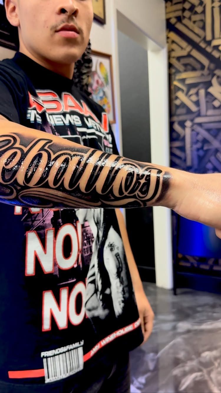
Chicano lettering grew from West Coast car culture and prison art, and the dramatic swashes still carry that origin even when the words are a family name or a blessing.
The script forms loop and extend with a confidence that takes practice to draw consistently.
Black and gray are traditional, though fresh work reads dark and will settle softer. Names are the classic use, short quotes work if the swashes have room to breathe.
I would ask to see the artist’s sketch at full size before the needle touches skin; the balance between the thick strokes and the hairline extensions is easy to lose in translation from paper to body.

【Most complete alphabet stencils sets】: You will receive 3 complete set of alphabets, includes uppercase letters, lowercase letters, numbers, beautiful floral pattern designs, and most common symbols signs in 3 sizes(large 4”, small 2” & 1”). These will give you endless possibilities of customized words to create any DIY art projects as you like.


22 Fonts & 13 Sizes: Includes calligraphy, Old English, script, and more, in sizes: 1/4, 0.3, 0.4, 1/2, 0.6, 0.7, 0.8, 0.9, 1, 1.25, 1.5, 1.75, and 2 inches
7. Old School Tattoo Fonts
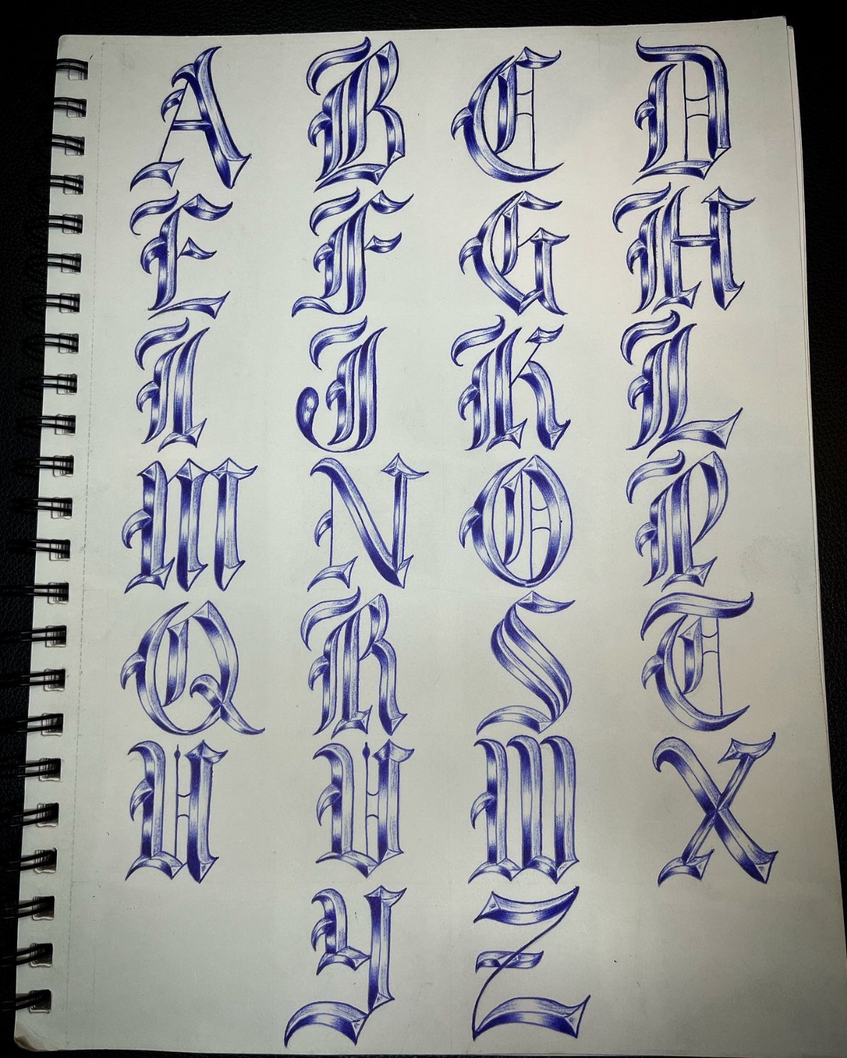
Old school tattoo fonts carry the visual weight of classic flash sheets, thick serif letters built to hold their shape whether they sit beside a skull, a rose, or stand alone on a bicep.
The heavy outlines and limited interior detail were designed for speed and longevity, and that same practicality keeps them readable decades later.
I would pair this lettering with traditional imagery rather than letting it float bare; the style expects a frame of some kind.
A single word in this font can anchor a larger piece or fill a hand-sized spot with authority. These letters do not shrink well, and they resist customization beyond color choice.

Realistic Finish: Different from you know ordinary temporary tattoo stickers or fake tattoos. It is so real and comparable to the real tattoo. It is a semi-permanent technology, Water-Resistant, friction-resistant, and can last for a long time, staying on your skin for 1-2 weeks.

Triple Blackout Tattoo Ink - Strengthen your shading with Triple Blackout, the boldest black designed for greater dimension in your tattoos. With a glycerin free formulation, this professional tattoo ink inserts smoothly into the skin for excellent distribution and shading.

Ultra-Thin Black Ink - This all-around black tattoo ink delivers the thinnest consistency without glycerin, offering super-smooth flow and rapid saturation for high-speed precision during lining and shading.
8. Fine Line Lettering
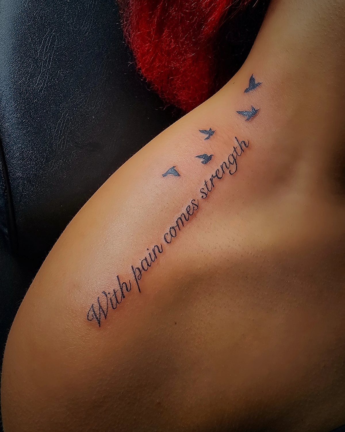
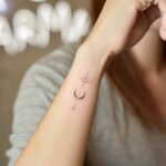
Fine line lettering trades impact for intimacy, hair-thin strokes that sit close to the skin and read as whispered rather than announced.
The style works for phrases you want to carry without displaying, words that reward someone leaning in rather than spotting them from across a room.
Fine line lettering invites small accompanying imagery without crowding the composition. I would keep the phrase short; fine lines spread and soften over time, and crowded letters blur together faster than open spacing.
A collarbone or inner forearm gives the clean surface this precision needs. Expect touch-ups within a few years as the thin strokes settle.

IMPORTANT SIZE INFO : Template measures 4 inches in length, letter height is 3 inches. Please verify dimensions before purchase to ensure it meets your project needs

【Quality Material and Safe Letter Stencils】: These alphabet stencils are made of high-quality eco-friendly PET material, sturdy for you to use, and not easy to break. No sharp edges, safe for you.

【Quality Material and Safe Letter Stencils】: These alphabet stencils are made of high-quality eco-friendly PET material, sturdy for you to use, and not easy to break. No sharp edges, safe for you.
Choosing the Right Font
The font you choose carries emotional weight before anyone reads the words.
A flowing script reads as private and reflective; sharp blackletter announces intensity before the first letter is deciphered. Match that tone to the meaning, not just the aesthetic.
Placement changes how the font behaves.
A collarbone script moves with breath and shifts under clothing; the same design on a forearm stays still and catches light differently. Consider whether you want the words discovered or displayed.
Elegant scripts suit phrases that need softness. Gothic lettering never softens its tone, which is exactly why it pairs with skulls, crosses, and anything else that refuses to apologize.
Bold geometric lettering belongs with designs that already carry visual weight. The wrong pairing, a romantic phrase in aggressive block letters or a memorial in graffiti style, fights itself.
Ask your artist to sketch the full phrase at size before you commit. A font that reads beautifully at poster scale can tangle when shrunk to wrist width.

Package Includes: You will receive 20 sheets reusable tattoo stencils, enough quantity to meet your daily requirements. The mehndi stencils are suitable for airbrush painting, glitter tattoo, and so on.

[Tattoos Stencils Kit]: 20 sheets (3.74’’*7.28’’ each) total 210pcs more mixed-size pattern stencil tattoos. Which featuring floral, butterflies,moons,tribal motifs,elephants and more patterns designs,enough quantity and different pattern for you create your tattoos style.
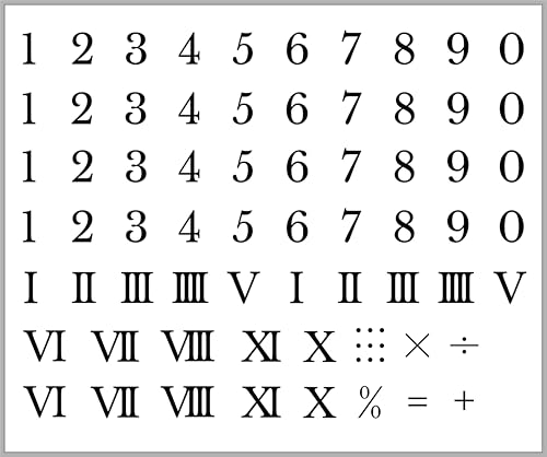
CUSTOM NUMERICAL TYPOGRAPHY: Features a comprehensive arrangement of classic Arabic numerals, a complete set of clean Roman numerals (I–X, XI, V–VIII), and essential mathematical symbols including plus, minus, multiply, divide, percent, equals, and ratio colon dots.
Tattoo Placement Tips
Lettering on the forearm offers the easiest reading angle for others and the steadiest canvas for the artist. The skin there sees sun, though, and fine lines fade faster than you might expect.
The chest holds larger compositions and moves less than the arms, but stretching during healing complicates aftercare. A vertical banner down the sternum frames numerals or single words with natural symmetry.
Inner bicep and rib placements hide easily but hurt more and limit your artist’s working position.
The lettering needs to be planned with the body’s movement in mind; a word that reads straight when you stand may distort when you sit.
Avoid spots where skin folds heavily or rubs against clothing during normal movement. Lettering requires precision, and a design that warps across a joint or crease loses its impact fast.

Packaging Details: You will get a set of 12 pieces reusable stencils for crafts. The collection includes 6 designs, each measuring 5.9 by 5.9 inches, and an additional 6 larger stencils, measuring 10 by 8 inches respectively.

Sufficient Quantity: there are a total of 10 pieces of stencils for painting in the package, with diverse styles and designs, giving you multiple choices, adequate quantity can meet your daily DIY and decoration demands, and you can share them with your close friends, family members, colleagues and so on, to enjoy the fun of DIY together
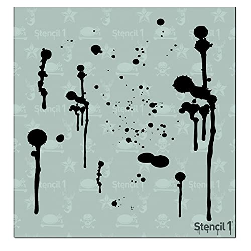
Bring the Drip Marks design to life with this original Stencil1 stencil — crisp lines and balanced detail that paint up beautifully.
Color Choices
Black ink remains the standard for lettering because it holds its edge against aging skin and varying light. Healed black lines stay readable decades later; color shifts and fades on its own schedule.
When color does appear in lettering, it usually serves the style rather than the words themselves. Graffiti pieces lean on bold fills by tradition.
Chicano work often carries earth tones that settle softer over time. Old school fonts limit color by design, a few interior accents at most.
Color in fine line lettering is rarely worth the trouble. The thin strokes already fight against spreading and fading; adding pigment complexity accelerates both problems.
If you want color, plan for more frequent touch-ups and stricter sun protection.
Black demands less maintenance and forgives more exposure. For words you intend to carry for life, that practicality matters more than the initial pop of a brighter palette.
Frequently Asked Questions
What is a tattoo style font?
A tattoo style font is a typeface drawn to work on skin rather than paper, with strokes thick enough to hold over time and connections that stay readable as the design moves with the body.
Script fonts mimic handwriting with planned linking strokes, while block letters use geometric weight and old school fonts carry the heavy outlines of traditional flash art.
The best ones account for how ink spreads and how skin ages, not just how they look fresh.
What type of tattoo is lettering?
Lettering tattoos are designs built from words, numbers, or phrases rather than imagery, rendered in a chosen font style that carries its own visual weight.
Lettering tattoos fall into several camps: script and block letters for readability, decorative numerals for dates, graffiti and gothic calligraphy for drama, Chicano lettering for that black-and-gray tradition, old school fonts for vintage flash appeal, and fine line styles for quiet precision.
Each carries its own history and its own hard limits on how small or complex it can go before it falls apart on skin. What the words say matters, but the style you choose says it first.
What is the cursive tattoo style called?
Cursive tattoo styles are called script fonts, sitting between handwriting and architecture with deliberate thickness changes that keep words readable as they curve across the body.
The weight variation matters more than most people guess: hairline upstrokes against thick downstrokes keep the rhythm visible, and loose letter spacing buys you insurance against the inevitable spread that comes with healing and decades of sun.
Keep the word count low.
A name, a date, a three-word phrase: that is where this style lives. Push it to a full sentence and the letters compress into a dark stripe you cannot read without stepping close.