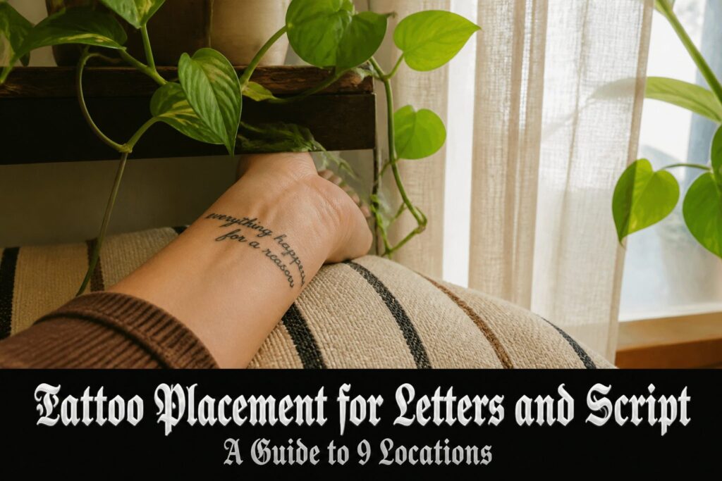
Tattoo placement for letter tattoos depends on how much the skin moves, how close it sits to bone, and whether you want the words visible to everyone or kept private.
A script piece on the wrist reads as an everyday affirmation you glance down at, but the same font sized too small, below 5–6mm per letter, blurs into a gray stripe within a few years because ink spreads where screen pixels do not.
[link-whisper-related-posts]Wrist and Forearm
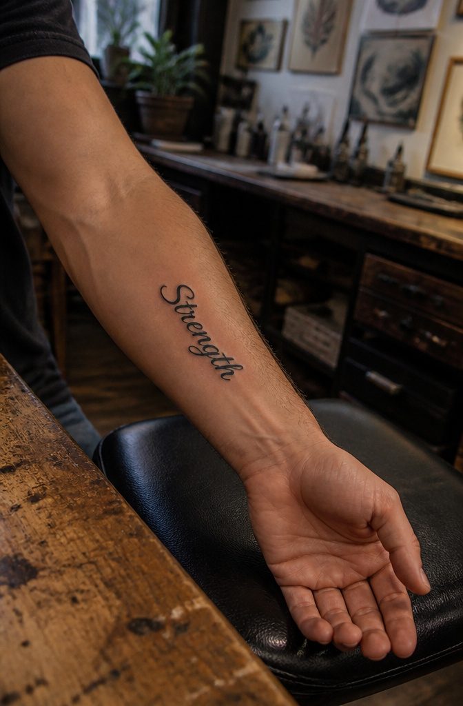
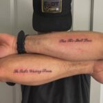
The wrist and forearm sit at that practical crossroads where you see the ink yourself and other people do too, which makes them among the best places for short quotes, names, or single words you want serving as everyday affirmations.
"Strength," "faith," "hope," the kind of thing you glance down at during a hard meeting and remember why you put it there.
Clean lines read well on flat skin, and a long sleeve hides everything when the occasion calls for it.
Individual letters need to be at least 5–6mm tall to stay legible as the tattoo ages.
Anything smaller holds detail for maybe a couple of years before the ink spreads slightly and turns your carefully chosen phrase into a soft gray stripe.
The common mistake is picking a font on a website, seeing it crisp at 12pt on a glowing screen, and expecting that same elegance at quarter-inch scale on skin.
Screen pixels do not blur; tattoo ink does. Your artist will tell you the floor size for the specific font you brought in, and that number deserves more respect than most people give it.
A no-outline design might look delicate fresh, but without that boundary holding the shape, five years of natural fading and sun exposure can leave you with something closer to watercolor abstraction than readable text.
A thin dark outline around each letter buys you insurance against that drift.
3MM Tiny Tattoo Practice skin Made from high-quality materials, it is closely mimic the texture and feel of real human skin. This gives you a realistic experience, allowing you to refine your skills before working on actual clients

Premium Quality 1.5mm Silicone Material – Crafted from premium 1.5mm thick silicone, this tattoo skin offers a true-to-life feel with excellent durability and a smooth surface for effortless needle movement during practice.
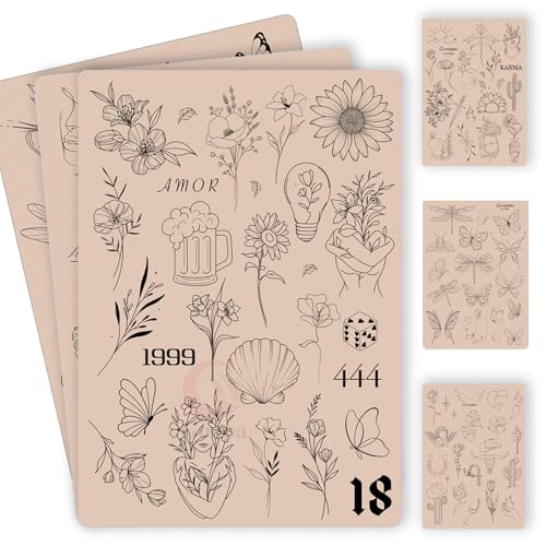
100+ Pre-Printed Designs – Features a wide variety of fine line and tiny tattoo stencils to enhance detailing skills.
Inner Wrist
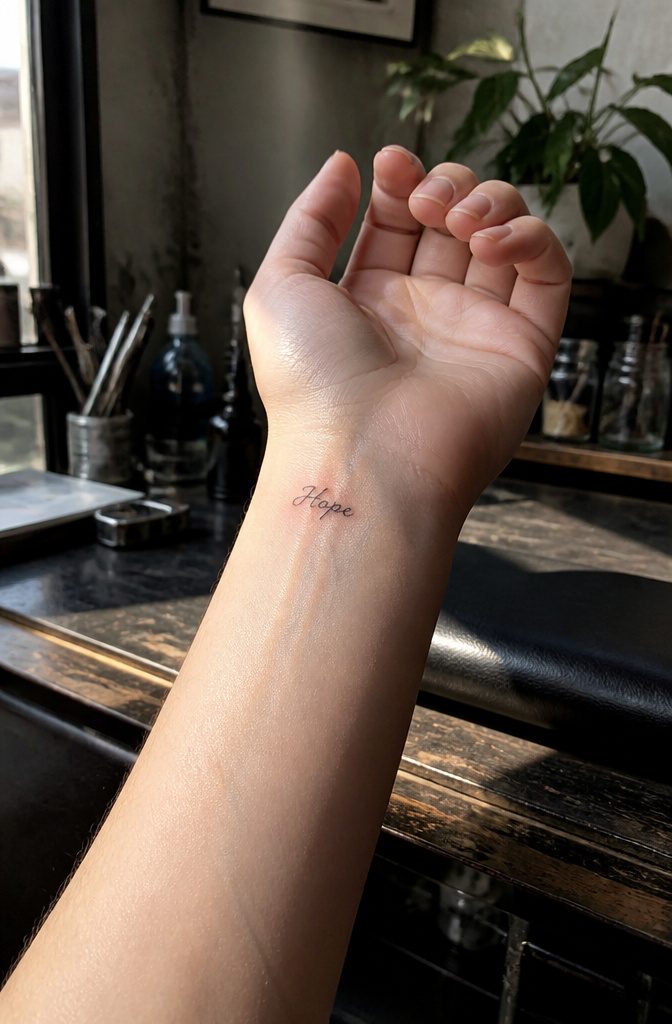
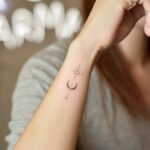
The inner wrist sits right on the radius, so the needle hums against bone with almost nothing in between. Sessions for lettering there are usually short, but stillness matters more than bracing for hours of pain.
That close surface makes the spot tempting for tiny words, single names, or short dates you want to glance at without rolling a sleeve.
Individual letters need to stay at least 5 to 6mm tall to stay legible as the ink settles and skin ages. What reads as delicate on a phone screen often blurs into a blue smudge within five years.
Your artist will name a floor size for your exact font; take that number seriously, because "discreet" turns meaningless when you cannot read your own tattoo.
The inner wrist also wears differently than the outer surface.
Sun hits it less, but friction from desks, keyboards, and watch straps hits it more. If concealment matters for a workplace, long sleeves cover it cleanly, though the placement itself stays visible enough that stillness during the session is non-negotiable.

【TEMPORARY TATTOO PACK FOR MAN WOMEN ADULTS KIDS】Each Size is about 200 x 100mm / 7.87 x 3.93 inch. Contains 5 sheets temporary tattoo paper stickers which are printed with non-toxic ink.

Realistic Finish: Different from you know ordinary temporary tattoo stickers or fake tattoos. It is so real and comparable to the real tattoo. It is a semi-permanent technology, Water-Resistant, friction-resistant, and can last for a long time, staying on your skin for 1-2 weeks.

★【16 Sheets Realistic Floral Proverb Words Temporary Tattoos For Women】--COKTAK Brand Vintage Black Mixed Style Proverb Words Tattoos. Package Includes 16 Sheets Realistic Waterproof Planet Lily Lotus Sunflower Rose Butterfly Floral Chains Tattoos Proverb Words Quotes Letters Tattoos Flower Chains Temporary Tattoo Stickers.
Ribcage and Side
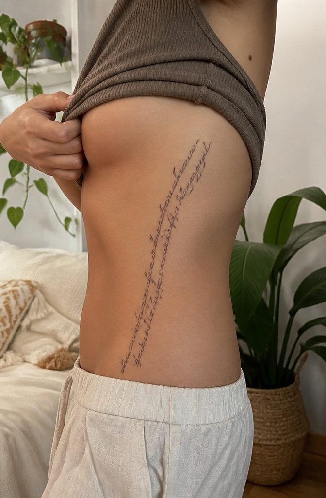
The ribcage carries longer quotes with a privacy you do not get from a forearm or collarbone. Script tattoos flow especially well here, the cursive following the natural curve beneath the breast or along the side where the body tapers.
Breathing complicates healing more than most spots expect: the skin shifts with every inhale, so a fresh piece rubs against bandages and clothing whether you sit still or not.
Some areas over the obliques sit on more muscle padding than bone, which dulls the needle slightly, but the intercostal spaces and floating ribs stay thin and tender.
Smaller pieces and single initials work tucked along the side, not just full verses; the placement scales down without losing its intimate quality.
Consider how often you twist, stretch, or sleep on that edge before committing to words meant to last decades.
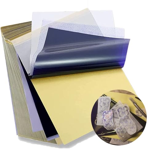
Standard size: Tattoo Transfer Paper is standard A4 paper size, each measures 8.27 in X 11.69 in. There are 4 levels in total. The thickness of the paper is very light and smooth to the touch.

Warm Tips: The tattoo transfer paper need to work with transfer medias.You will need to purchase the stencil ointment separately. Apply the design made on the master paper. Please pay attention to press the back side of the pattern to the skin for at least 3 seconds
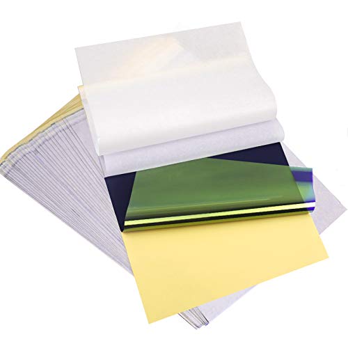
ADVANCED MATERIAL: Tattoo transfer paper is made with the high quality dyes and stencil paper. Transfer marks are very clear, clean and smooth. Tattoo transfer paper kit come with 35 sheets. Great for tattooing, trace and transfer images onto the body.<br>
Spine and Back
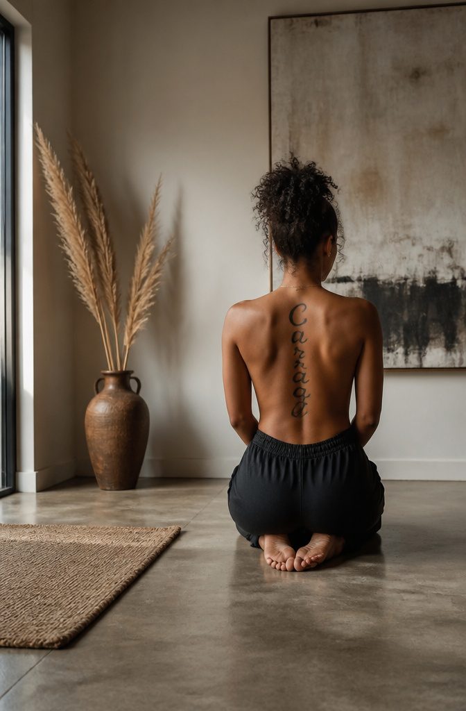
A spine tattoo turns a single line of text into a vertical column of ink that moves when you do, and that motion is part of the design whether you planned for it or not.
The natural curve of vertebrae gives script a built-in flow that flat skin on an arm or thigh simply cannot replicate.
Something about following the backbone reads as backbone, too. Resilience, spiritual growth, courage, whatever word you choose, the placement quietly insists you mean it.
The practical reality is less poetic. Aftercare becomes a guessing game; you cannot see the stencil to check for irritation, and a bathroom mirror only catches the top third.
Healing takes longer when skin flexes with every bend and twist of a normal day. The pain is significant, especially directly over bone, and experienced artists are not optional here.
One misaligned letter in a vertical script throws off the entire piece, and you live with that asymmetry every time you catch a partial glimpse in a reflective storefront window.

Crystal Clear Transfer & Stable Stencil Effect : Our KVM transparent tattoo stencil film delivers sharp, clean printed lines. The pattern transfers perfectly onto skin, not easy to smudge or wipe off after application. It works great for intricate mandalas, skulls, portraits and line art.

Precision Transfer Performance - It’s professional-grade tattoo stencil paper delivers vibrant, high-definition transfers even for intricate designs. The carbon layer ensures sharp outlines without smudging or fading, ensuring crisp lines that stay true to your original artwork.

Precision Transfers & Long Lasting: Tattoo stencil paper delivers vibrant, high-definition transfers even for intricate designs. Creates crisp, dark lines that transfer cleanly to skin (clearly on different skin tones) which are easy to follow during tattooing. The carbon layer made from high-quality dyes ensures sharp outlines without smudging or fading and maintains crisp lines visibility throughout long tattoo sessions, so you can focus on creating art instead of re-drawing lines
Collarbone and Shoulder
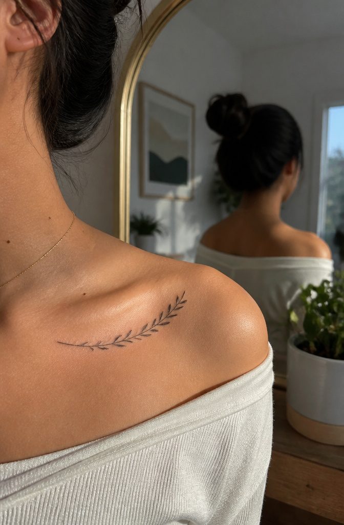
The collarbone sits right there on display, its thin ribbon of bone shifting under skin that moves every time you lift your arms or turn your head.
That constant motion makes lettering tricky. An artist who knows their craft will size the letters and adjust the spacing so the phrase still reads straight even as the natural curve of your body tries to bend it.
Affirmations work well here, short phrases you glance at in the mirror after dressing.
A tank top or scoop neckline shows them off completely; a crew neck or buttoned collar drops them from sight. That easy toggle between visible and private is why so many women choose this spot for a first word tattoo.
Pain runs moderate to high because the needle passes directly over bone with almost no padding.
Sessions for lettering stay shorter than image work, which helps, but the spot still demands stillness. Curved surfaces also challenge the line itself.
The sternum slopes inward, the shoulder rounds outward, and the collarbone between them traces its own arc. A skilled lettering artist follows those contours with custom spacing rather than forcing uniform letters onto uneven ground.
The result can look elegant when it works, but the bone makes it unforgiving.

Stand out from the Crowd: We provide you with 6 different types of 2609 hair rhinestones, including coloured teardrop hair gems, coloured star hair gems, full-colour crystal hair gems, clear crystal hair gems, pearl hair gems, glitter letters rhinestones stickers, which are more sparkling than the rhinestones of the toys.You can match your outfit and different theme party to create eye-catching hair styles that will make you stand out from the crowd. Everywhere you go is the focus.


Stone Manufacturing
Chest
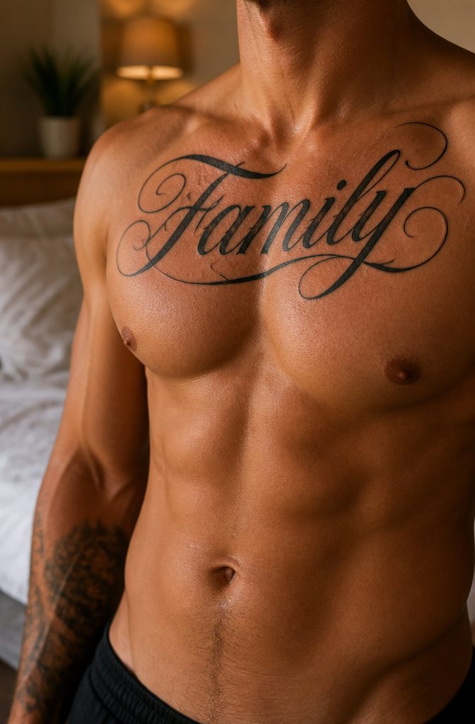
The chest gives lettering room to breathe. A line from your grandmother, a full stanza, even a short paragraph across the pec stays readable because the muscle underneath stays mostly flat whether you are standing straight or turned slightly.
That stability matters for words more than for images; a serif tilting the wrong way is a typo you have to live with.
Pain splits the territory cleanly. The sternum, with bone an inch under skin, hurts sharply and steadily, while ink laid over the pectoral muscle itself rides on softer tissue and settles into a duller, more manageable throb.
Most people I have talked to who carried a session to the finish mark the sternum as the wall they had to push through, not the muscle.
Long term, this placement ages harder than almost anywhere else.
Skin thins and chests shift with weight change, and lettering that started crisp crowds inward as decades pass. Going too small courts trouble; tighter kerning and thinner strokes blur together when the canvas itself starts to give way.

Material: the pink tattoo practice skin is made of high quality silicone. Thickness of skin is 1.5mm. These skins replicate the thickness and texture of real skin and are compatible with any machine and needles.

GUIDED DESIGNS FOR FOCUSED PRACTICE: Five thick patterned tattoo skin give beginners clear visual references for outlining, curves, corners and detail work. Tiger, dragon, skull, rose and lotus artwork helps vary each session instead of repeating one simple motif

Master Tattoo Techniques: Practice like a pro with our silicone pre-printed tattoo practice skin featuring 9 intricate tattoo patterns including Sun, Eyes, Flowers, Butterfly, Snake, Tiger, Ox, and Fish.
Upper Arm
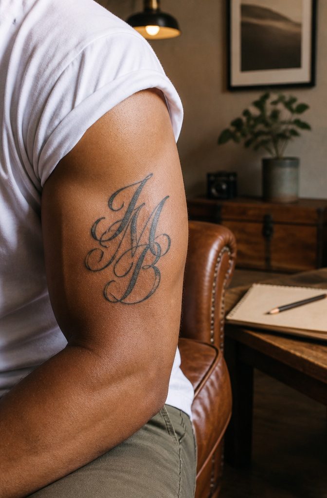
The upper arm carries initials and short phrases better than almost anywhere else.
Pain stays low through most of the spot because the deltoid and biceps pad the bone underneath, enough that my first tattoo sat there for exactly that reason.
You notice the machine more on the inner curve toward the armpit, where skin thins and the nerve bundle runs closer.
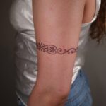
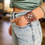
Cylindrical muscle shapes the real decision. A straight line of text down the outer face reads clean when your arm hangs naturally, but the same words running around the arm wrap and distort.
I have watched someone get a band of dates circling the bicep; from straight on you catch fragments, never the full line, and the artist had to keep the lettering large to keep it legible.
Vertical placement solves this. Horizontal block lines across the front work only if you scale them wide and accept that half the text disappears from most angles.
Visibility breaks cleanly here. Sleeveless and the ink shows; a short sleeve drops to mid-bicep and hides everything above unless you fold your arms.
That half-hidden quality suits commemorative dates or names you want privately nearby, not broadcasting. Summer becomes a conscious choice, which some people prefer to the always-on display of a forearm or wrist.

Package included: 30 sheets temporary letter tattoo stickers with 10 styles, each style have 3 sheets(10 letter stickers are arranged on 2 large stickers, and you will receive a total of 6 large stickers.). You can customize custom name tattoos, which have fashion style and color,make you look more unique and cool. Enough to meet your use and replacement needs.

Realistic Finish: Different from you know ordinary temporary tattoo stickers or fake tattoos. It is so real and comparable to the real tattoo. It is a semi-permanent technology, Water-Resistant, friction-resistant, and can last for a long time, staying on your skin for 1-2 weeks.

🌊【12 SHEETS Jesus Angel Temporary Tattoos For Women Men Adults】GOROMON Unique Design Waterproof Realistic Angel Tattoos Including 12 Sheets chicana Chicano Cholo Chola Christian Faith Prayer Religious Belief Holy Spirit Dove Pigeon Angel Jesus Tattoos Family Themed Engraved Letters Tattoos Gangster Robber Poker Bad Guy Women Face Chicano Temporary Tattoo Sticker.
Ankle and Leg

Ankle and leg placements offer that quiet, almost hidden quality many people want for a single word or a small phrase, especially on a first venture into script.
The look stays sleek because the skin is smooth, the lettering sits cleanly, and a pant leg drops over it in most settings.
Pain splits sharply between two spots here. Over the ankle bone, the needle hits thin skin stretched directly across bone, and the vibration registers as one of the sharper sensations on the body.
Drop two inches lower onto the calf muscle and the experience changes; the tissue cushions the work, and sessions run longer without the same intensity.
What aging does to this area deserves more attention than most first-timers give it. Sun hits the lower leg relentlessly from spring through fall, and ultraviolet light breaks ink down faster than on a torso kept under fabric.
Socks and boots add friction, especially at the sock line where fabric rubs the same patch daily. Fine script with letters spaced too tightly, placed in these conditions, will blur sooner than bold lines on a protected inner arm.
Healing brings its own complication.
Gravity pools fluid downward, so the ankle and foot swell more than a shoulder or chest would. Walking keeps the area in motion, stimulating blood flow but also delaying that first crisp settling of the ink.
Plan for shoes that slip on without pressing the tattoo, and expect the swelling to hang around a few days longer than placement guides for other spots typically promise.

Safe and Healthy: Our tattoo transfer gel meets strict safety and non-toxic material standards, non-irritating to the skin and vegan-friendly. Maintains client comfort while achieving clear tattoo stencil transfers.

🔵【CLEAR & CONSISTENT TATTOO TRANSFERS】 WZPB tattoo transfer paper produces clean, crisp stencil lines with excellent detail retention, helping artists achieve accurate transfers for lettering, geometric designs, portraits, and intricate artwork.
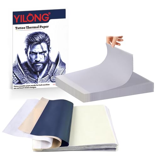
【4 Layer A4-sized Stencil Transfer Paper】- 10.9*8.4 inch tattoo transfer paper features four layers: a protective layer, design layer, release layer, and a yellow backing layer. The white master sheet is for design application, with a removable translucent protective sheet (needs to be removed before use), blue carbon paper, and an additional backing layer for enhanced stability. It's fade-resistant, easy to use with a thermal copier or ballpoint pen, making it convenient and user-friendly
Behind the Ear
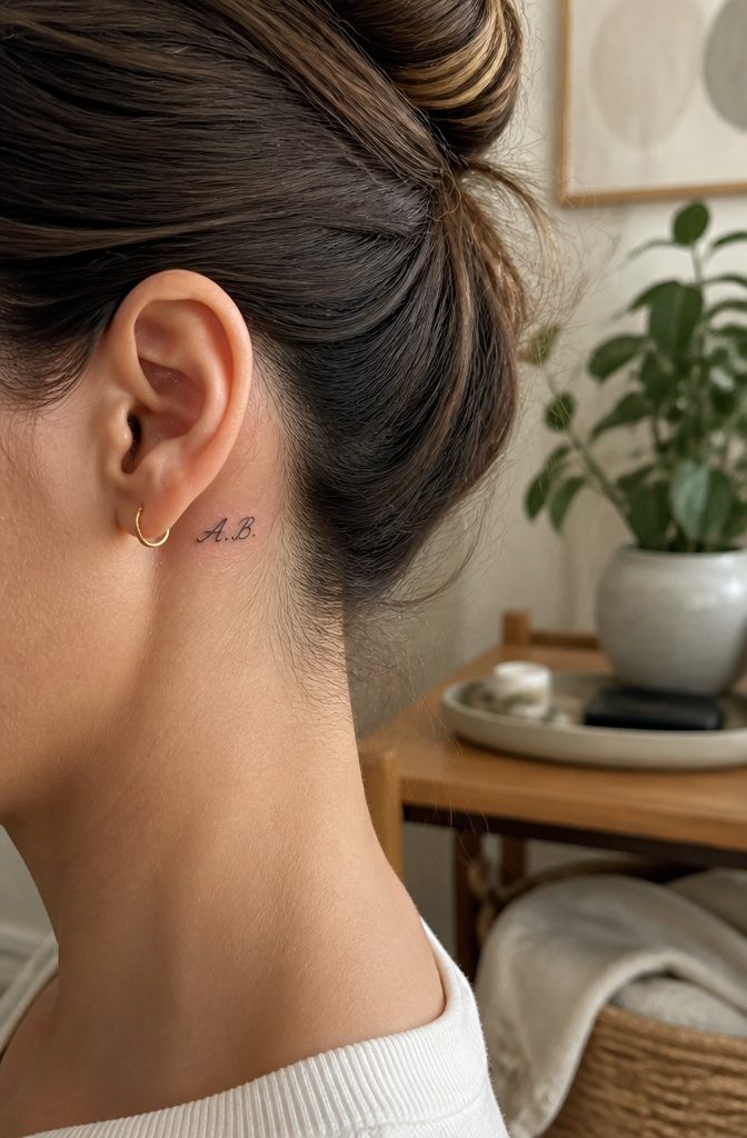
The skin behind the ear is paper-thin and sits almost directly on bone, which makes this one of the more sharp, vibrating spots to sit through.
That buzz travels straight through the skull, so expect the needle to rattle your teeth if you go for anything with fill.
A simple line of initials or a single word reads as a whisper rather than a statement, and that is usually the point.
Space runs out fast.
Most people end up with three to six characters at most, stretched vertical or tucked along the natural fold. Longer phrases crawl out onto the neck or shrink to illegibility, neither of which ages well.
Hair covers it completely when down, shows in a ponytail or pixie cut, and grows in unpredictable ways that can shift how visible your ink reads year to year.
In most offices the spot flies under radar, though interview-day updos require planning if your workplace leans formal.

【100pcs Tattoo Stencil Paper Kit】Tattoo Stencil Paper kit come with 100 sheets tattoo stencil paper. 4 Layers of transfer paper includes the master sheet, transparant protective sheet, blue carbon sheet and yellow backing sheet, size approx. 8 1/4" x 11 3/4" which can be cut down into smaller sheets for more use.

Clean, Flawless Transfers: Your artwork will look so clean once transferred to the skin with the Stencil Stuff gel! Gentle on the skin, Stencil Stuff transfer solution helps you achieve clear and sharp tattoo stencil transfers every time!

Phomemo Tattoo Transfer Paper Kit: Paper size: 8.27" 11.69" (210 297 mm). Quantity: 1 box (100 sheets). Color: Blue. This Tattoo Stencil Paper features a dotted line design, allowing for easy tearing without tools. Tear off the master design and yellow backing sheet effortlessly for a smooth tattooing experience. This product is suitable for tattoo enthusiasts, artists, and professional tattoo artists, offering reliability and consistency in tattoo stencil creation
Font Selection
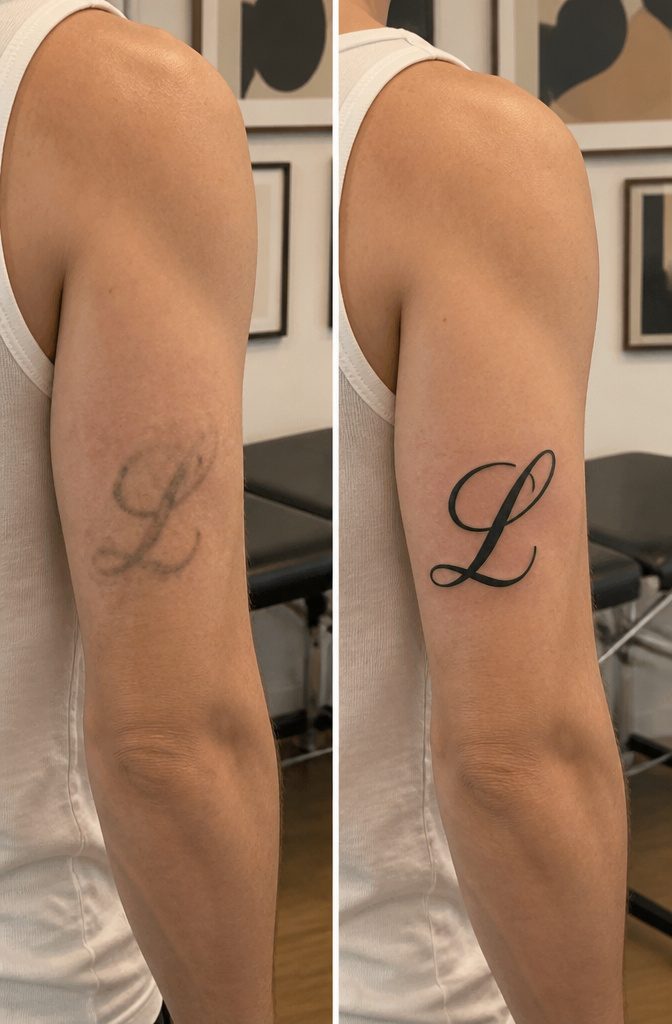
Script fonts look elegant on paper or on a screen, but ink under skin behaves differently.
Over years, pigment lines soften and spread slightly. A bold image barely registers the change; delicate letterforms with tight spacing turn into indistinct smudging.
Individual letters should be at least 5–6mm tall to hold their shape as this happens. Below that threshold, adjacent characters merge and readable text becomes watercolor-like blur.
The spacing matters as much as the height.
Letters packed too close run into each other as edges expand. A lettering artist will name a minimum size for your specific font, and that number deserves real weight even when it pushes the placement larger than you pictured.
Block fonts carry better longevity.
Their weight and simpler forms leave more margin for the natural spread of ink. Script can work, but it needs the room to stay legible.
The mistake I see most often: someone falls for a font shown at 12pt on a website, then expects the same refinement tattooed at a quarter inch.
What reads refined on screen collapses into illegibility within five years on skin. Scale it to actual size before you commit, or trust your artist when they say it needs to grow.
Artist Selection
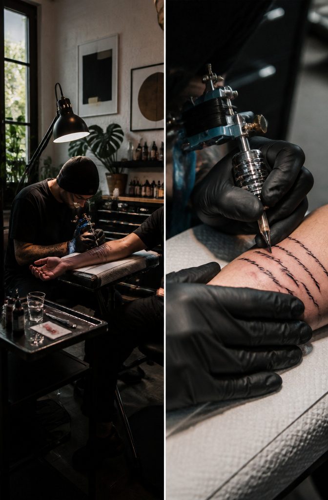
Every lettering tattoo lives or dies in the spacing between letters, and not every steady hand can pull that off.
I’ve watched artists who kill at traditional Americana lay down script so cramped it collapses into a blur by month two.
Ask for healed photos, not just fresh work, because ink settles, spreads, and the crisp line you saw in the studio flash won’t tell you what holds.
Lettering demands its own skill set. Kerning, tracking, adapting weight to the curve of a rib or the flat of a forearm, these are not side skills.
An artist who specializes in script will adjust your chosen phrase so the thicks and thins balance against your specific placement rather than distorting over time.
If you want true calligraphy rather than an adapted font, confirm the artist practices both disciplines. The overlap exists, but it is not guaranteed.
Same goes for custom versus pre-designed type: fonts built for screens fail on skin that moves and ages, so trust the specialist to redraw spacing and stroke weight for your spot, or walk.
Aftercare for Lettering
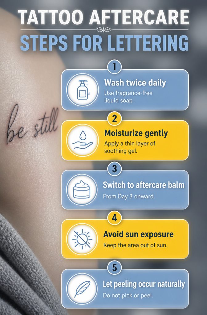
Fine line lettering is among the most vulnerable tattoo work during healing. A single thin line that develops a heavy scab and loses pigment underneath it produces a gap in a letter that’s very hard to touch up cleanly.
Keep the skin moisturized enough that it doesn’t form thick, pulling scabs, without over-moisturizing to the point of maceration. Over-moisturizing softens the healing skin and lets ink spread beyond the crisp edges the artist laid down.
Wash twice a day with a fragrance-free liquid soap, pat dry with a clean paper towel, and apply a thin layer of soothing gel after each wash for the first three days.
From Day 3 onward, as surface peeling begins, switch to an aftercare balm.
Sun exposure during healing fades the pigment permanently, and pools or baths let bacteria into the open skin. Picking at flaking skin pulls pigment out with it, and this is where letter detail is most commonly lost.
Fine lines face more risk than bold work throughout this process; bold strokes hold more ink at greater depth, so they survive minor mishaps that can ruin a delicate script.
Keep the area out of sun and water until fully healed, and let any peeling come off on its own schedule.
Personal Significance
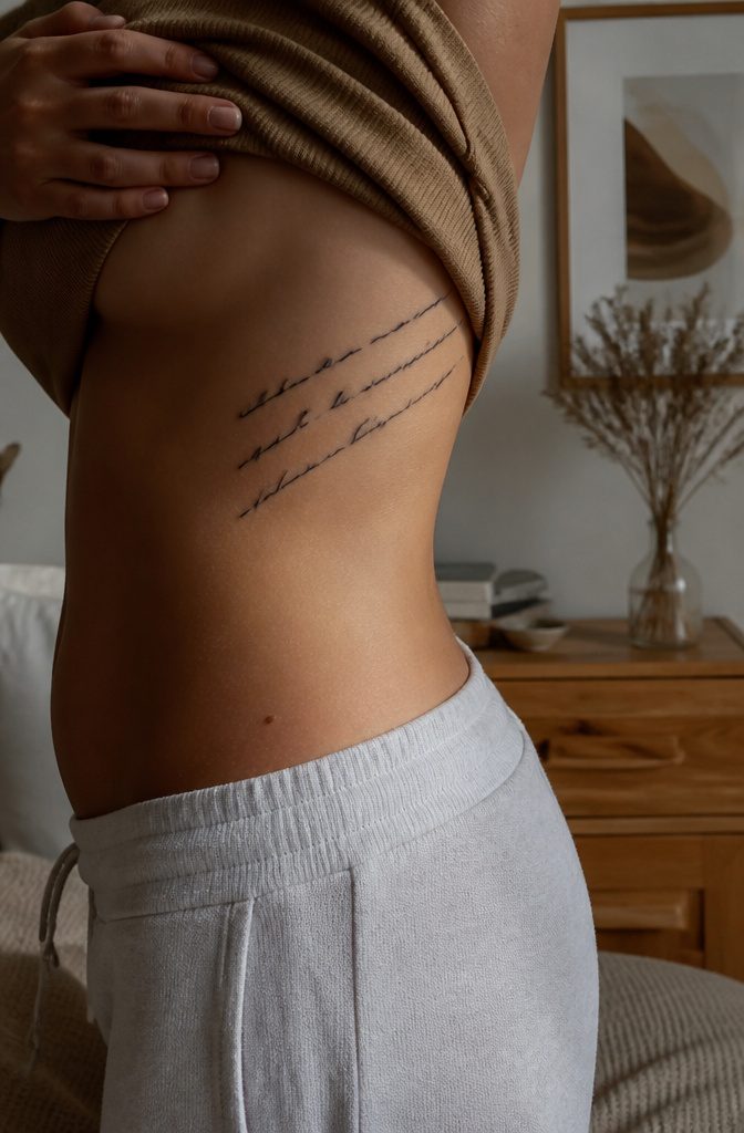
The chest carries what you hold closest, which is why ribcage tattoos often hold longer quotes with deep significance.
A partner’s name, a child’s birth date, a line from someone who is gone: the bone sits right under the skin, and the placement keeps the words literally at heart.
In my experience researching placements, the ribcage is where people put what they do not say out loud.
The wrists and collarbone work differently. Those spots stay in view, so they carry what you want to proclaim.
A "Carpe Diem" small enough for the wrist reads as a daily reminder you choose to carry, not a secret you guard. The same phrase hidden on the ribs becomes private by default, visible only when you decide.
Pain tolerance shapes this choice in real ways.
The ribs and spine hurt more because of thin skin over bone, while the forearm or leg costs less in discomfort. What you are willing to endure for placement mirrors what the words mean to you.
Someone who sits through rib work for a paragraph from a novel is making a different statement than the person who chooses the forearm for easy visibility. Neither is wrong, but only one reads as something you keep close.
Frequently Asked Questions
What is the best placement for letter tattoos?
The best placement depends on the size, visibility, and personal significance of your tattoo.
Short quotes and names work well on the wrist and forearm for daily visibility, while the ribcage and spine suit longer quotes you want to keep private.
The chest carries deep meaning for many people, and the upper arm balances low pain with easy concealment.
How small can a lettering tattoo be?
Individual letters should be at least 5–6mm tall to stay legible as the tattoo ages.
Anything smaller holds detail for only a couple of years before ink spread turns crisp text into a soft gray stripe. Your artist will name a minimum size for your specific font, and that number deserves real respect.
Why is font selection important for tattoos?
Font selection matters because ink under skin softens and spreads over time, while screen pixels do not. Delicate letterforms with tight spacing blur into indistinct smudging, so block fonts generally carry better longevity than thin script.
A lettering artist should adapt spacing and stroke weight for your specific placement rather than copying a font directly from a website.
What is the 1/3 rule tattoo?
The closest principle discussed is the minimum letter height of 5–6mm, which functions as a hard floor below which legibility collapses within a few years.
What is the rule for tattoo placement?
The guiding rule for lettering specifically is that flat, stable surfaces read more cleanly over time than areas with constant motion or friction.
Letters need 5–6mm minimum height, and placement should match your goals: wrist and collarbone for daily reminders you want to see, ribcage and spine for private meaning, upper arm for easy concealment.
What is the hottest tattoo placement?
It notes that the wrist and forearm are common for first word tattoos because they sit at a practical crossroads where you see the ink yourself and others do too, and that many women choose the collarbone for a first word tattoo because of its easy toggle between visible and hidden.
What’s the most painful tattoo placement?
For lettering specifically, the sternum and spine rank among the most painful because the needle passes directly over bone with almost no padding.
The ribcage and inner wrist also hurt sharply. The upper arm and outer forearm stay milder because muscle cushions the bone underneath.